Release notes
March 2026December 2024July 2024February 2024
September 2023
May 2023
January 2023
November 2022October 2022September 2021August 2021May 2021March 2021August 2020July 2020June 2020May 2020April 2020
September 2023
May 2023
January 2023
November 2022October 2022September 2021August 2021May 2021March 2021August 2020July 2020June 2020May 2020April 2020
March 13, 2026
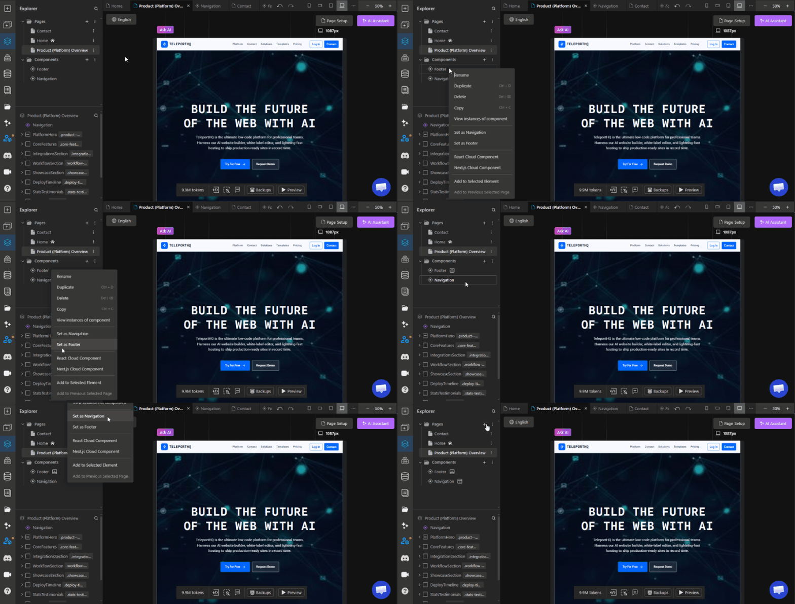
v5.3.44This release notes article covers a lot of the works that has been done in TeleportHQ in 2025. It covers project backups, the native form submission management system, the new data source integrations feature for connecting external databases and APIs as well as the completely rebuilt AI Website Builder and AI Assistant.
Highlights
Major updates
Project backups
You can now create backups of your project that you can return to at any time. Project backups allow you to restore your website to a previously working version of your project if something unexpected happens. There is also an autosave feature running in the background creating backups every 6 hours.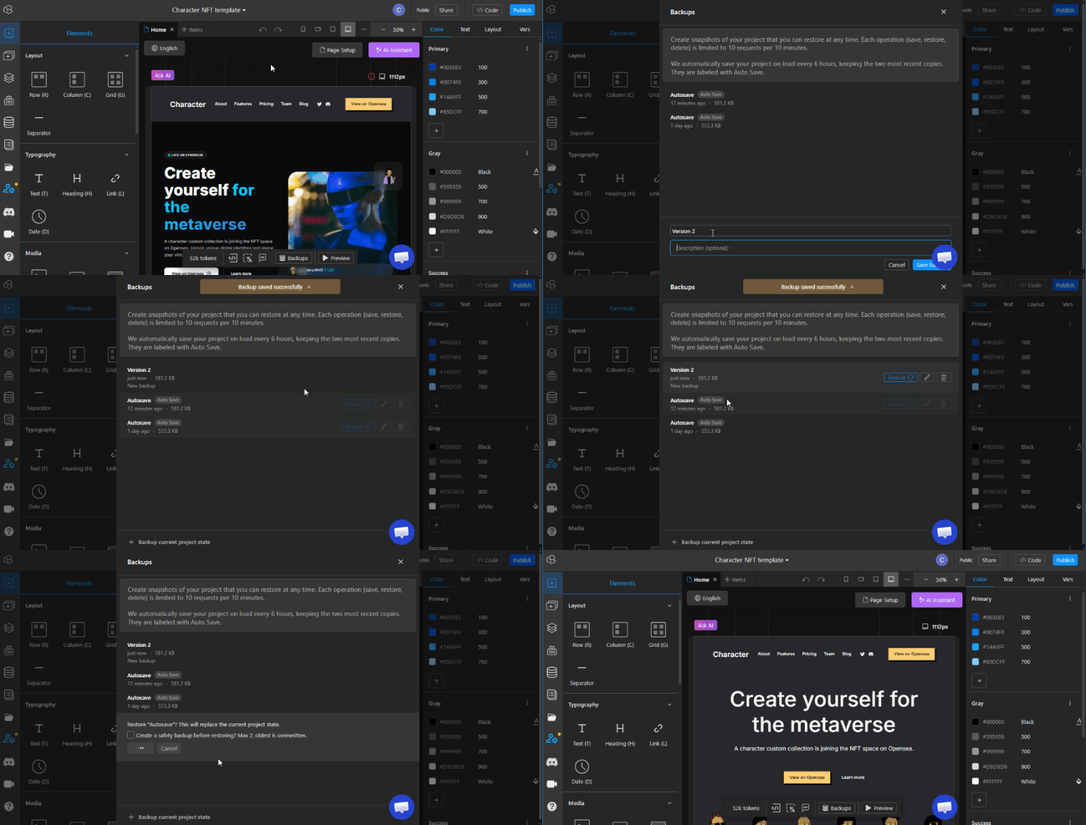
You can now create backups of your project that you can return to at any time. Project backups allow you to restore your website to a previously working version of your project if something unexpected happens. There is also an autosave feature running in the background creating backups every 6 hours.

Data sources
Data Sources is a brand new feature that allows you to connect external databases and backend services such as Supabase, Airtable, PostgreSQL, MySQL, Google Sheets and others, with greater stability and clearer mapping controls.
This enables you to power your websites with real data while maintaining full design control inside the visual editor.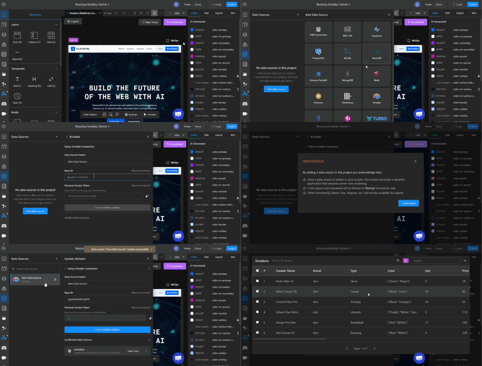

TeleportHQ Forms Management System
We launched a native Forms Management System that allows users to manage form submissions directly within TeleportHQ. You can now collect and manage incoming data without relying entirely on third-party tools.
This creates a smoother end-to-end workflow, from visual form creation to data collection and management, all within the same platform.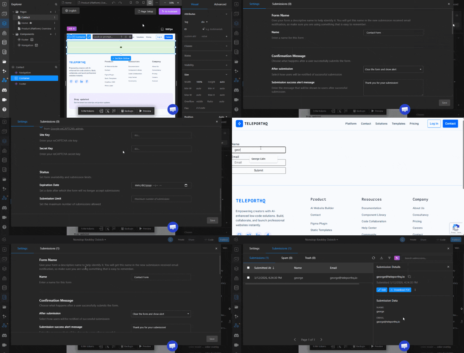

Improved SEO Toolkit
We’ve made significant updates to the way we handle SEO for our websites. We have added an automated system of updating the sitemal.xml, added canonical URL control and made it easier to set up and manage redirects.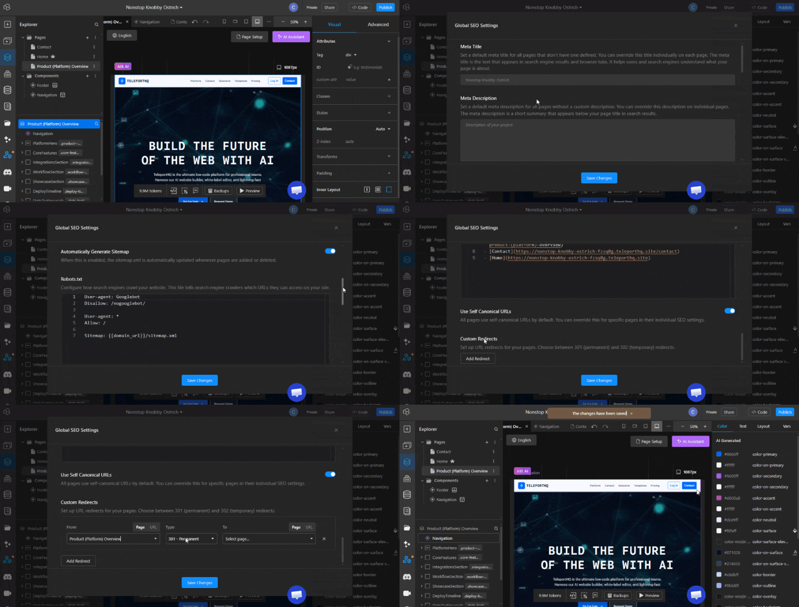
We’ve made significant updates to the way we handle SEO for our websites. We have added an automated system of updating the sitemal.xml, added canonical URL control and made it easier to set up and manage redirects.

AI Website Builder
The entire AI website building experience has been rebuilt from the ground up. The new builder greatly expands the variety and quality of generated websites through a more advanced setup process.
You can now define your business industry, colors, fonts, pages, animation level, and more, all fully customizable and under your control.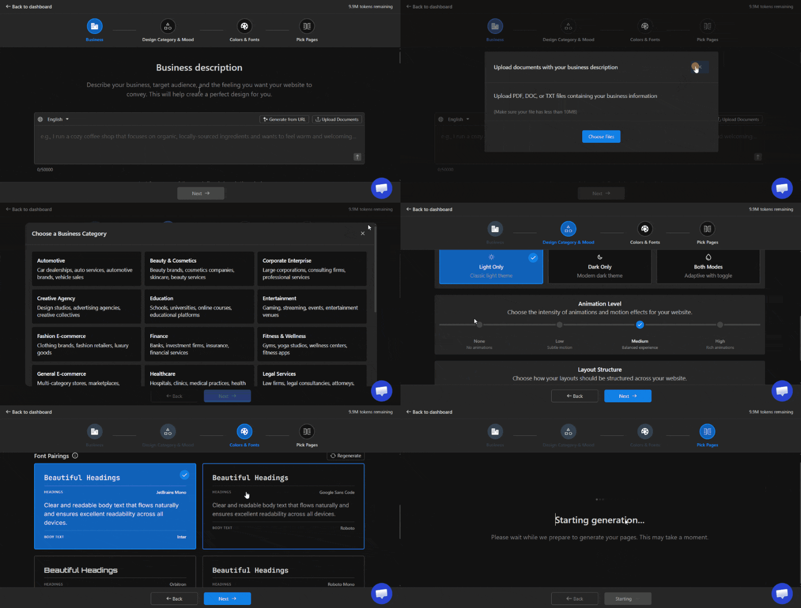

AI Assistant
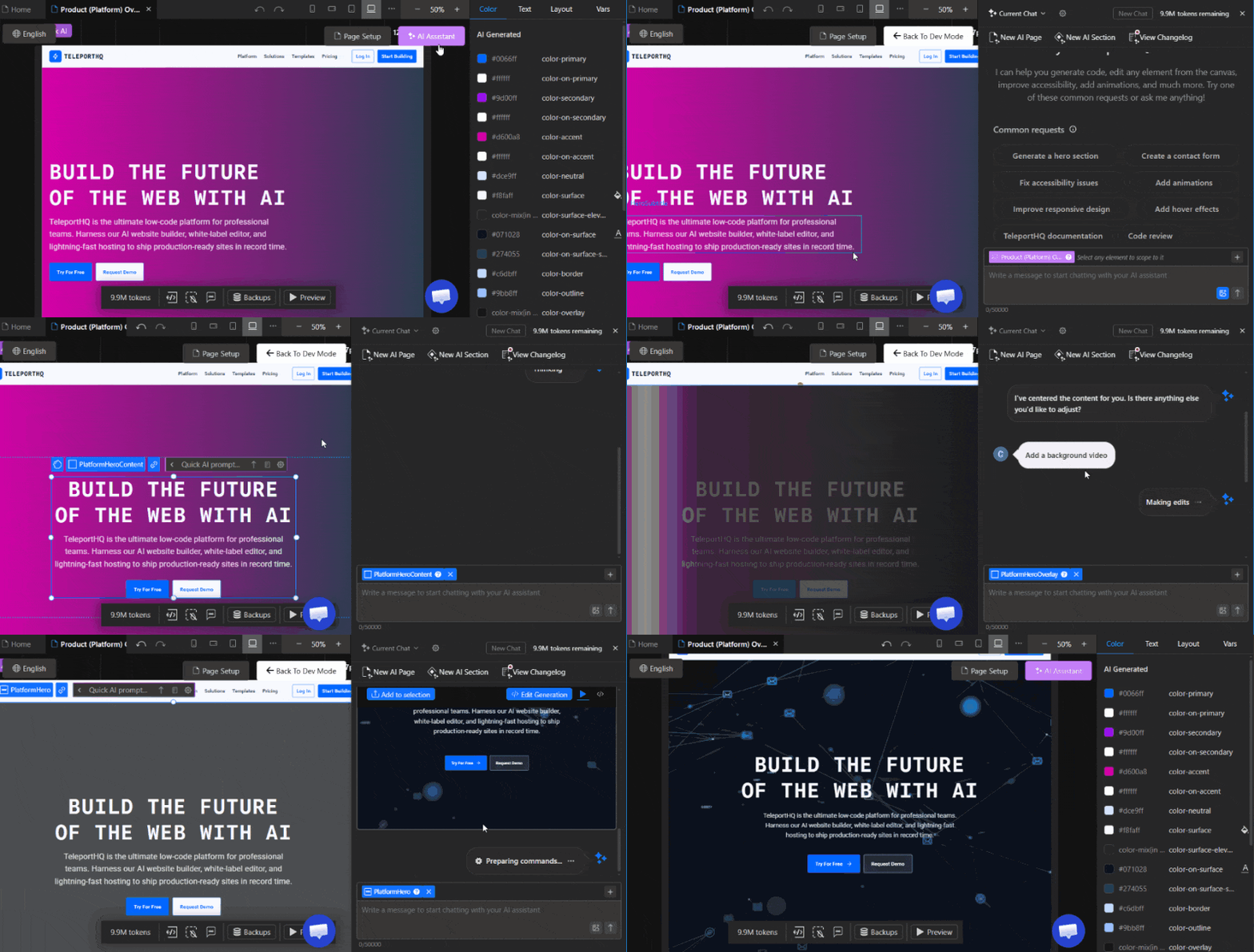
The AI building power of TeleportHQ comes together inside the editor through the AI Assistant. The AI Assistant can edit any part of your website after it has been generated. It can modify layouts, update styling, add functionality through scripts, and perform a wide range of other tasks.
With the AI Assistant, you can quickly build and modify almost anything on your website.

AI Quick-prompts
A more compact version of the AI Assistant, Quick Prompts allow you to make fast edits to individual elements without writing complex prompts. They are designed for quick adjustments and small improvements directly inside the editor.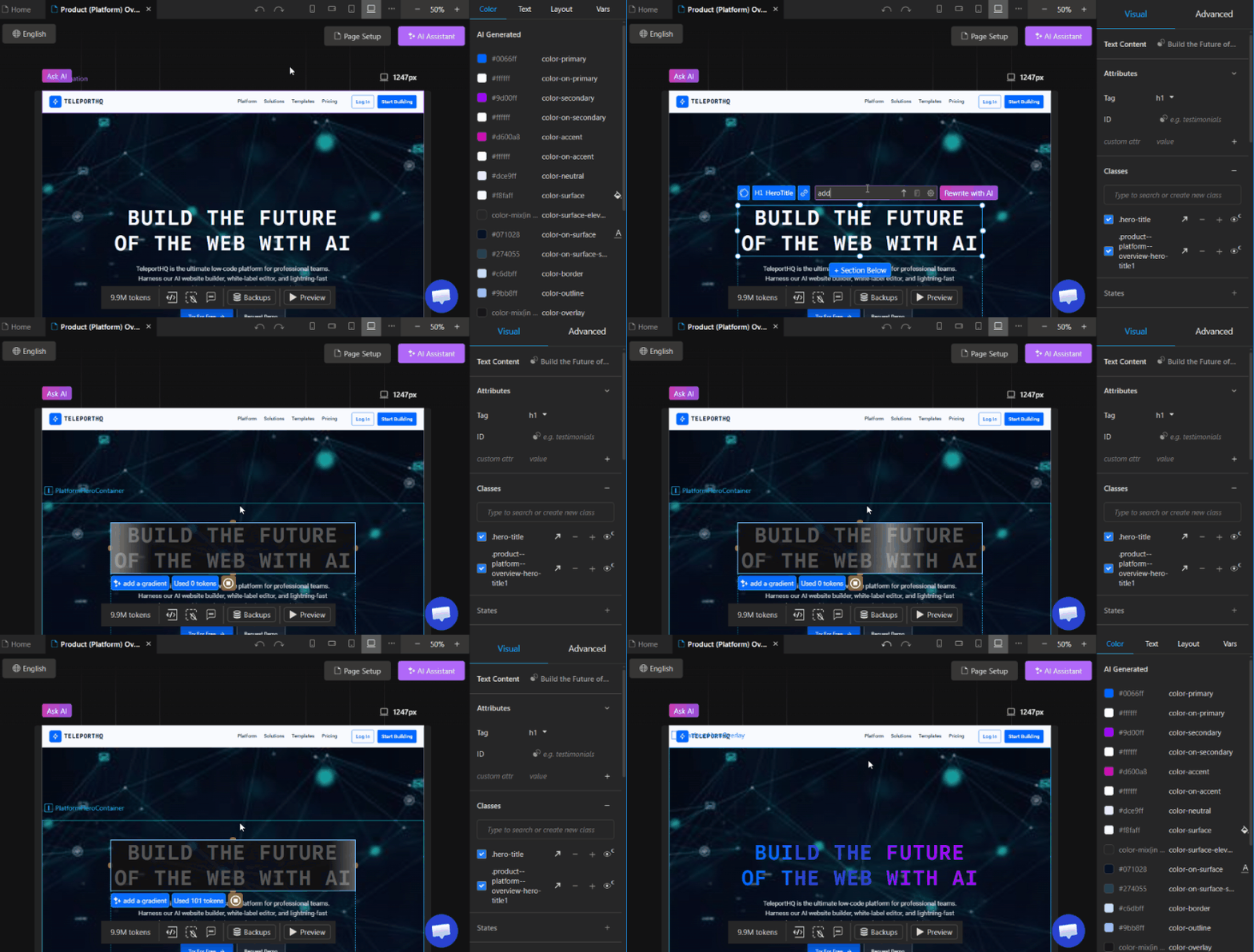
A more compact version of the AI Assistant, Quick Prompts allow you to make fast edits to individual elements without writing complex prompts. They are designed for quick adjustments and small improvements directly inside the editor.

Generate Images with AI
Create or edit images using AI without leaving TeleportHQ. There is no need to switch between multiple AI tools to generate visual assets, everything you need is now available directly inside the platform.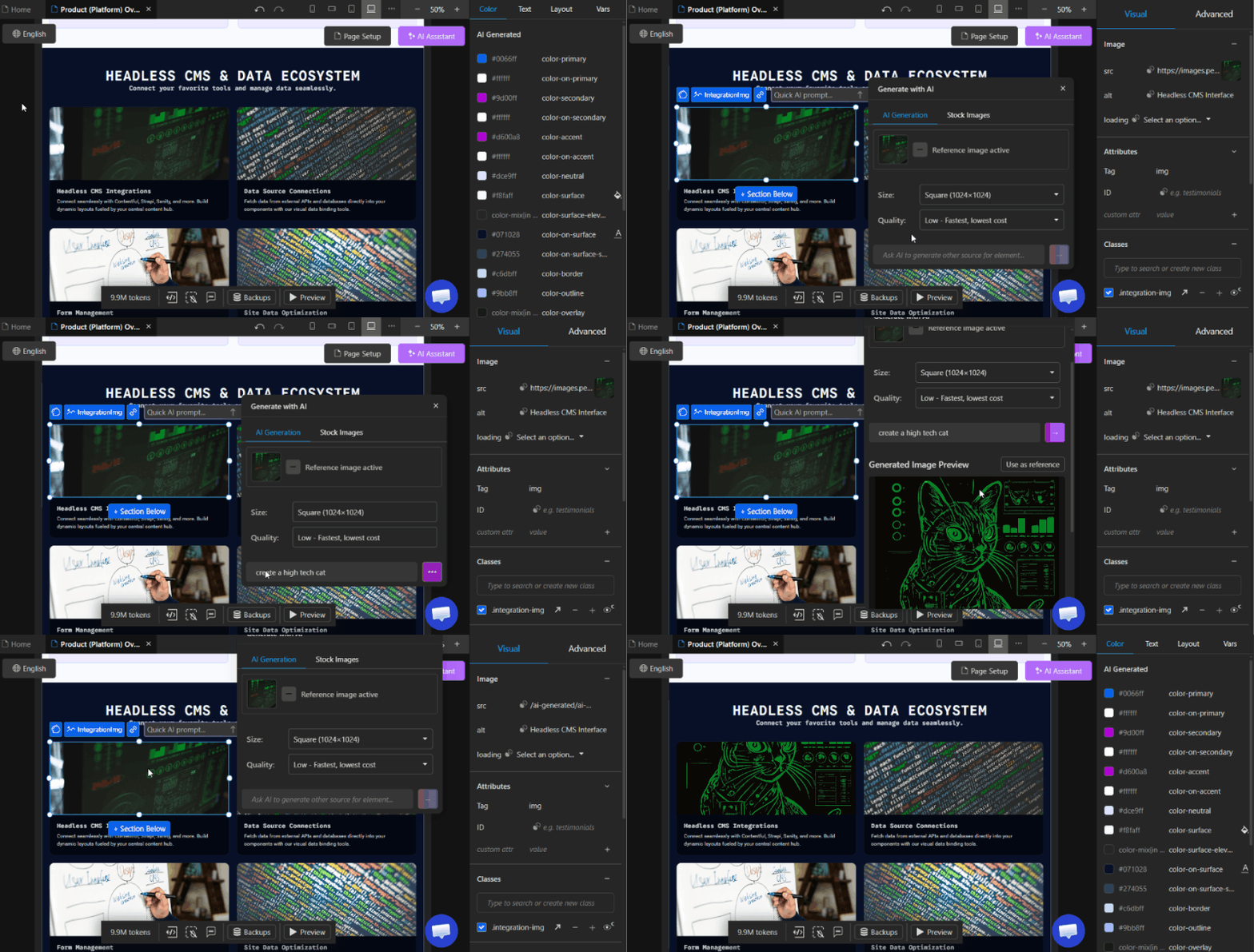
Create or edit images using AI without leaving TeleportHQ. There is no need to switch between multiple AI tools to generate visual assets, everything you need is now available directly inside the platform.

Updates
Previewer update
The Previewer has been completely rebuilt for more accurate real-time rendering. It now better reflects production behavior, responsive breakpoints, active scripts, and dynamic data rendering.
This ensures that what you see during preview is significantly closer to what gets deployed, reducing surprises after publishing.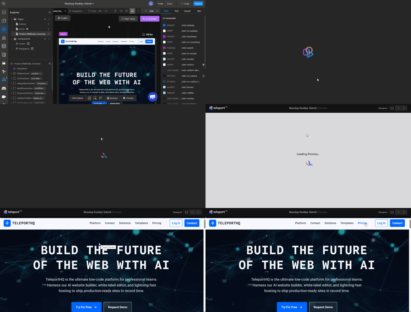

Automated Navlinks
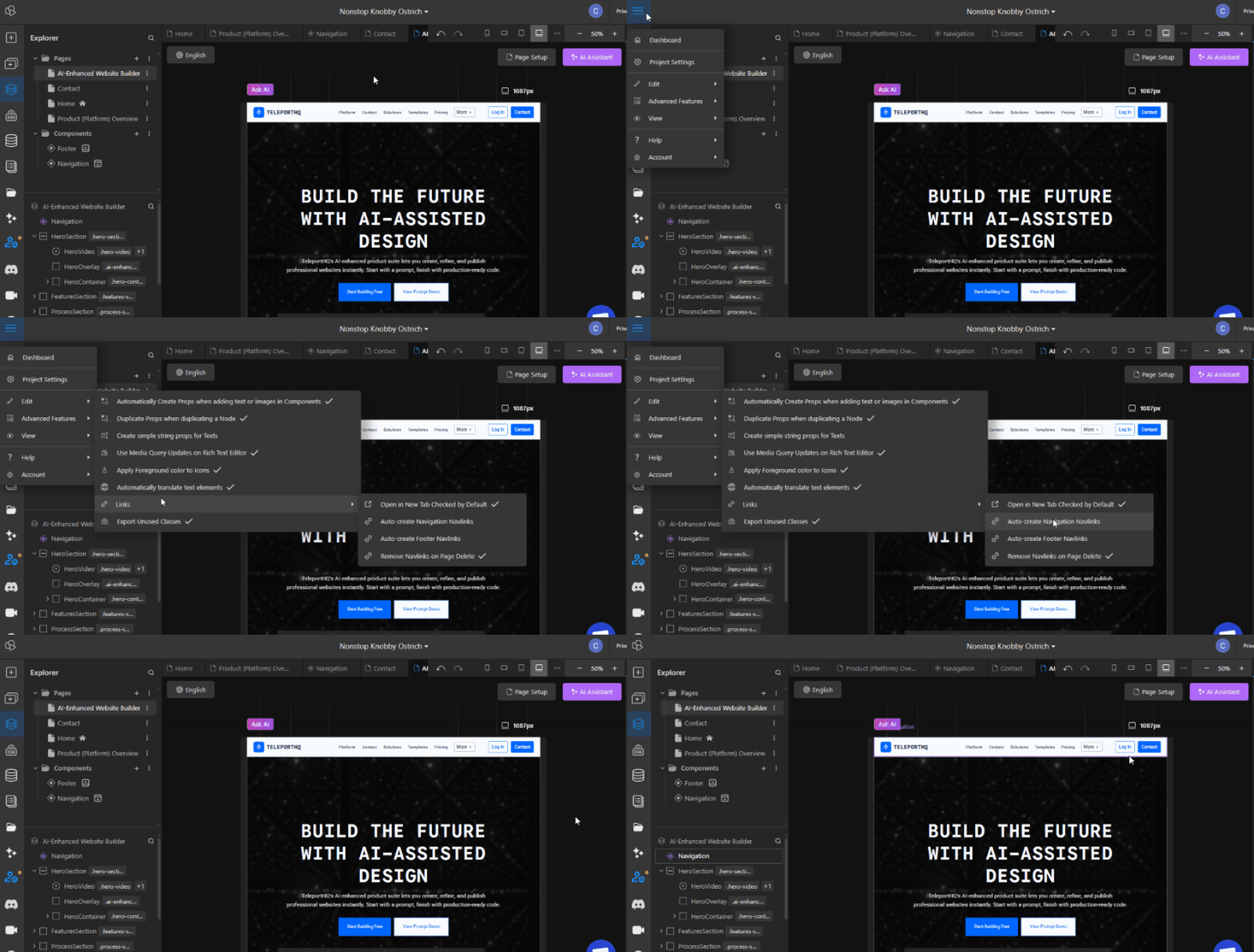
You can enable a feature that automatically adds links to new pages in your Navbar and Footer.
When enabled, a new Navlinks element will appear inside the default Navbar and Footer components. When creating or deleting pages, the Navlinks element updates automatically to reflect the current site structure.

Inspector UI Improvements
The Inspector panel (right panel) has been expanded with additional properties such as Overflow and Ratio, Transforms, more options for Inner Layout, Backdrop Filter controls, improved margin and padding configuration, and other usability improvements.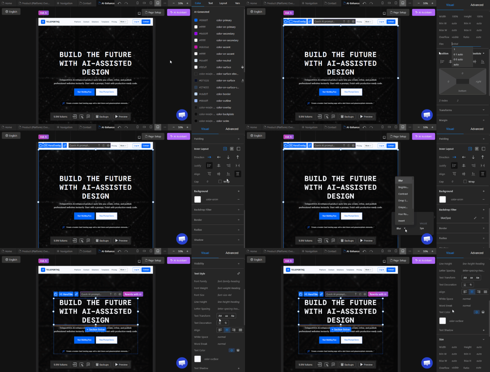
The Inspector panel (right panel) has been expanded with additional properties such as Overflow and Ratio, Transforms, more options for Inner Layout, Backdrop Filter controls, improved margin and padding configuration, and other usability improvements.

Table element support
Table HTML elements are now supported as native elements inside TeleportHQ. They can be filled manually or configured to display dynamic data from external data sources.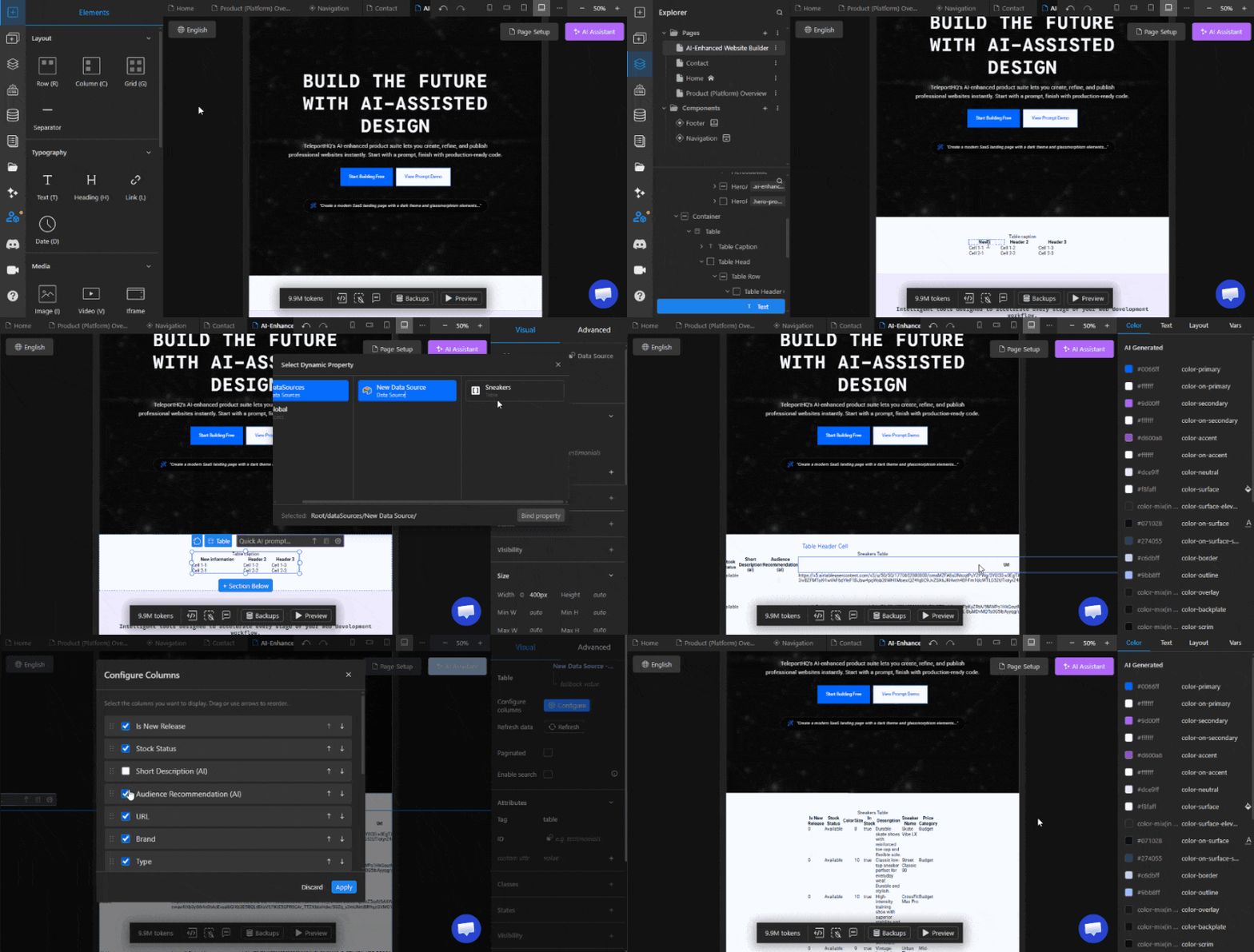
Table HTML elements are now supported as native elements inside TeleportHQ. They can be filled manually or configured to display dynamic data from external data sources.

Update to Props panel
The Props panel on the right side of the canvas, which appears when selecting a component instance, has been updated with better organization between attributes, links, and content. Link properties can now also be configured to Open in a new tab.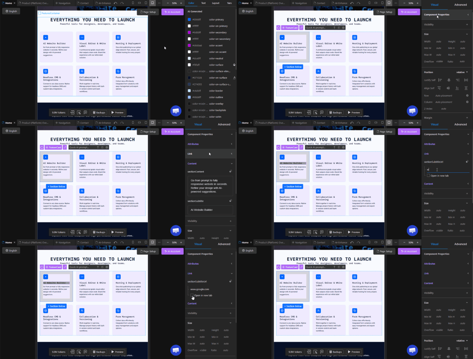
The Props panel on the right side of the canvas, which appears when selecting a component instance, has been updated with better organization between attributes, links, and content. Link properties can now also be configured to Open in a new tab.

Custom domain aquisition flow
We’ve made it easier to purchase additional custom domain slots when needed. A new button has been added to the Publish tab, and a new Custom Domains section is now available in the Workspace settings where all connected domains are displayed and managed.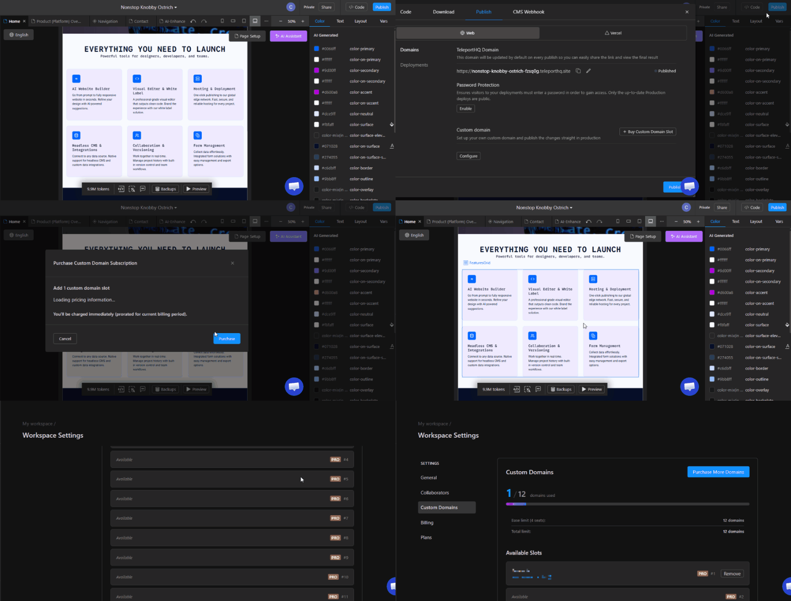
We’ve made it easier to purchase additional custom domain slots when needed. A new button has been added to the Publish tab, and a new Custom Domains section is now available in the Workspace settings where all connected domains are displayed and managed.

URL panel update
The URL panel, where links are configured, now includes a Dynamic links section that allows you to set URLs dynamically either from a connected data source or by using component props.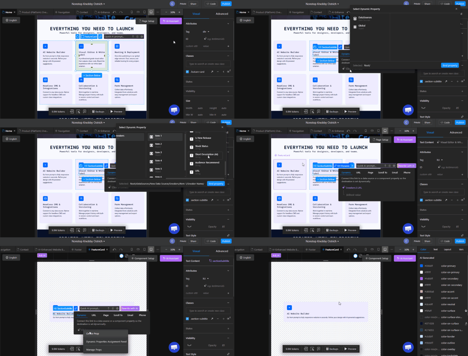
The URL panel, where links are configured, now includes a Dynamic links section that allows you to set URLs dynamically either from a connected data source or by using component props.

Improvements & Fixes
- HTML Import improvements to support additional HTML tags
- Fixed issue with links on localized websites
- Fix for Supabase data source integration
- Fixed issue when deleting components containing forms
- Fixed sitemap.xml not generating properly
Future releases
- Workflows: Create complex workflows for your websites either manually or using AI.
- TeleportHQ Data source: We will provide our own native data sources, not just integrations.
- E-commerce: Create and manage e-commerce stores directly from TeleportHQ, complete with products, pricing, invoicing, and more.
- Blogs: Set up and manage blogs for your projects
- AI Chat Assistant: Set up an AI powered chat-bot on your website.
- Website admin: Create an admin panel for your website with signup and signin logic, charts and statistics, and simple management tools for e-commerce and blog features.


