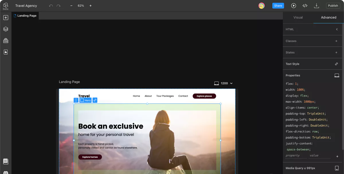
Create a Responsive Website Online and for Free, in Minutes

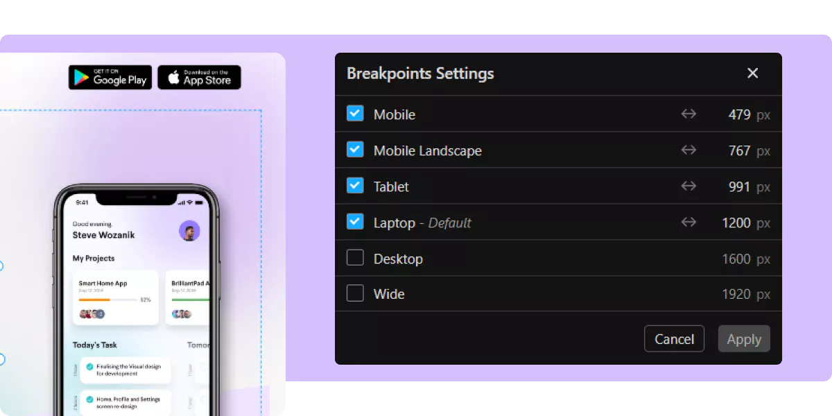
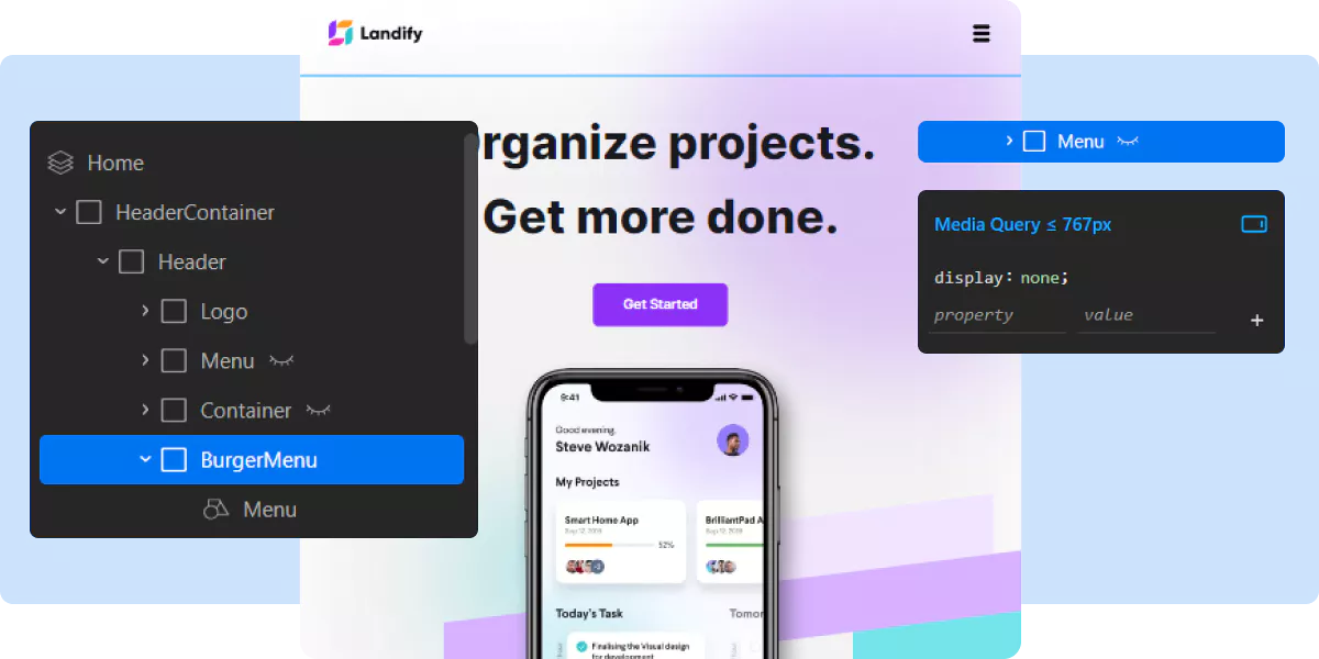
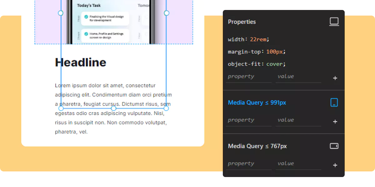
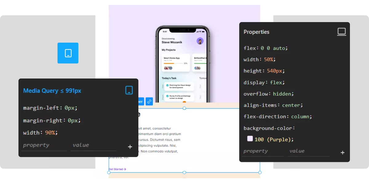
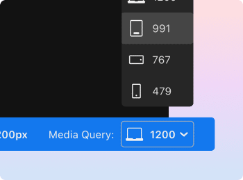
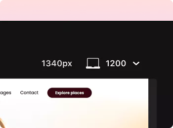
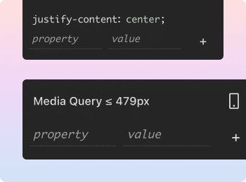
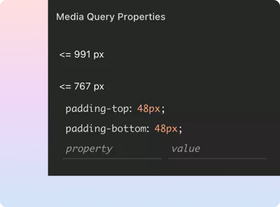
Create responsive websites using a smooth drag and drop functionality. Make your web design mobile friendly, now faster than ever.

Use our responsive HTML/CSS/JS code editor to easily adjust your designs for the size of every device or browser.
design mobile responsive websites
static responsive pages and websites

Create static responsive pages or entire websites using TeleportHQ

Edit and style your website the way you want. Our low code design platform makes working with responsive website themes easy and accessible for people of all skill levels.In addition, TeleportHQ allows you to publish or export your page in HTML code, making it a friendly and flexible design platform.Create your website

How to make a website responsive following this simple guideline

We guide you every step of the way with a simple tutorial on how to make your website responsive. Regardless of your skill level you can get a fully responsive design using the TeleportHQ code editor.

Adjust each breakpoint for responsive design

Verify and adjust each breakpoint view from mobile, tablet or various desktop browsers.You simply need to set a breakpoint at each point where the content layout needs to behave or look different to ensure a smooth navigation with a dynamic and readable content across different device viewport.
image
image

Use media queries

Use media queries to style each section of your page for a specific breakpoint. CSS media query breakpoints need to be used for every device that is going to render your design. Using a media query every time you switch to a different breakpoint you can improve the readability aspect of your content.

Select the appropriate nav menu

On a desktop screen a navigation menu will be visible at the top of the website. The same menu needs to be adapted to a smaller mobile device, with different screen size and resolution.The same navigation menu from the desktop will appear as a hamburger menu on the mobile screen.
image
image

Use responsive images

Use responsive images or visuals and make sure they are as light as possible. To make your images responsive, you will need to display them in the most appropriate way for each specific device and adapt the content you serve to users based on device resolution, orientation, screen size and so on.

Decrease font size for smaller screens

As you design for smaller screens, make sure to decrease the font size accordingly and make sure your typography is as responsive as your entire design.There are different font size guidelines and typography rules for desktop or mobile screen sizes that you need to consider.
image
image

Fixed or relative sizing for page elements

Use relative sizing so that elements will adjust in response to other elements inside a layout.Choose between different responsive measurement units such as em, rem, vw, vh or percentage to adjust the dimensions of your elements and containers as well as dynamically change paddings, margins and borders.
Ai powered websites brainstorming

How to optimize images for responsive web design

The quality of an image can impact the perception of your page design. To ensure a positive impression, your images need to be crisp, and adapted to the user’s screen size and resolution, rendering a correct aspect ratio.

There are various image optimization techniques where you can resize and compress images for mobile, without sacrificing the quality

Ready-made responsive web design templates

Build responsive websites within minutes with minimum coding skills. Our static website templates are free, fast and mobile-optimize. Click on any design template and edit your HTML code to make websites mobile friendly. Start now for free without signing up. TeleportHQ is the only platform that offers free access to your design source code.

Agency Responsive Template

Use this responsive website template for your digital/start-up agency and start filling in the content that best describes your activity. Customize the style and add images to make it mobile friendly. Export or download your project's code for free.
Start with this template

Responsive Web App Template

Start from this plug and play template to make a mobile friendly application. Edit any of the responsive components and replace the visuals to better represent your mobile app. Use a variety of sections that showcase features, testimonials, product presentations and many other important components of a responsive website.Start with this template

Travel Responsive Website Design

Start with a prebuilt page structure for the story you want to tell on your traveling website. Use this modular design for your agency website or even your personal blog. Customize this responsive layout with your own pictures and give it the style and personality you want.Start with this template

All in one responsive website builder

Create your own websites, web or mobile applications using the best free low-code development platform.
Adaptive web designStart creating responsive web designs that instantly work for any mobile device. TeleportHQ makes it easy for you to go through each media query breakpoint and adjust elements to make the design responsive.
Intuitive on-page website EditorCreate quick content changes using our browser-based intuitive on-page website editor, keeping your designs consistent and making sure they stay responsive trough out the editing process.
Tech and non-tech friendlyA drag and drop website builder made for the tech-savvy that want to continue writing code outside our platform. If you’re a designer, marketer, or any other type of stakeholder, our responsive website builder can generate code for you.
Figma plugin integrationEvery good project starts with a good design. Teleport allows you to export to code any Figma design. Get a faster design to developer project turnover by using our free Figma plugin.
Open-source Code exportDevelop responsive web apps and websites and export your work in the development environment of your choice. Export your production-ready code in 9 different JS frameworks.
Reusable componentsCreate generic components that can be duplicated and adapted to fit your design, or use ready-made responsive design components or entire website sections like responsive navbar and hamburger menus, header sections, and so on.

Create responsive navbar and hamburger menus using HTML, CSS

Start using modern solutions by implementing responsive navbars and hamburger menus for your website. Create a fully functional and user-friendly website with a focus on architecture, navigations, and user experience on every device.
Sign up for free

An advanced browser-based website editor that helps you create a responsive and consistent user experience

easy change design breakpoints

Change easily between your breakpoints

Go through the most common breakpoints and view how your design adapts to every screen size
Please add another row here.
responsive design on any screen size

Make sure your design is responsive on any screen size

While working in the canvas, you will see a media queries banner that informs you at any time of the exact breakpoint on which you work.
CSS styling properties

Apply different CSS/styling properties

Media queries allow you to apply custom CSS/styling properties on elements in different views and screen sizes.
advanced CSS styling properties

Go into an advanced mode for your global CSS styling properties

Access the advanced mode where you will see all the global properties of an element, plus media queries applied on different screen sizes.
check website responsiveness

Use dynamic view to check the responsiveness of your website

You can always play with the resizing mode to see a dynamic view of how responsive looks on every screen size. Just drag the margin of your design.
media queries CSS classes

Use media queries inside CSS classes

Apply custom CSS styling inside a class, by setting different properties on different views and screen sizes.

Create responsive websites online in a professional low-code development environment

TeleportHQ is not just a traditional website builder, quickly validate your ideas by creating responsive prototypes of your project. Our low-code development platform allows you to go from design to code in record time. Preview responsive layouts in real-time on any screen resolutions with the built-in breakpoint system.
Try it now. It's free!responsive web design
made-with-teleportBuilt in TeleportHQ