UI components are essential for web design and web development. They contribute to the consistency of user interfaces and help developers speed up their work significantly. Thanks to React components, designers and developers speak a common language and can handle UI building challenges faster and easier.
React components are helpful when you work with front-end development platforms like TeleportHQ. With our TeleportHQ static website generator, you can easily import and customize UI components from any paid or open-source React library. To see how TeleportHQ works, sign up today and start low-code web building through a seamless workflow.
In this article, we will explain React UI component libraries and why they are an essential asset for React developers. We will also shortlist the ten best React component libraries so you can pick the one that works best for your project.
What is a React component library?
React component libraries are collections of pre-built standalone elements. These components are reusable across multiple projects, saving you considerable time and reducing repetitive work. React components are valuable assets for building web pages, mobile apps, and web apps using the ReactJS framework.
React UI components offer great versatility because they are modular, and you can combine them in various ways to serve different purposes. Also, they are built with the best practices in mind to provide an outstanding user experience.
Why are React component libraries important?
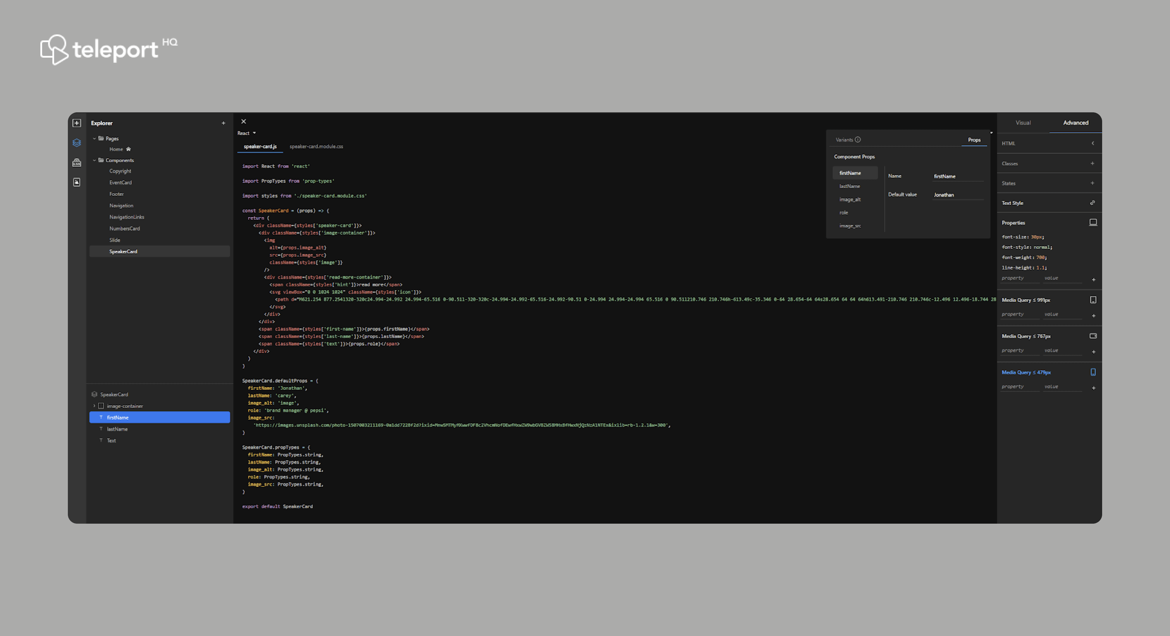
With a new custom code solution you will be able to Edit component properties TeleportHQ.
React component libraries offer a single source of truth for all developers in any organization. The use of component libraries ensures consistency, scalability, and efficiency.
By turning to the same source every time, developers minimize the risk of discrepancies in the design. Scalability is a result of reusing components across multiple screens. Efficiency directly results from skipping repetitive work as you don't have to design and build components every time you start a new project.
What are the advantages of React UI component library?
Component libraries bring many advantages and allow organizations to apply a systematic approach to designing and developing web and mobile applications. Here are the seven benefits that make React components a real game-changer for design and dev teams.
- A common language for designers and React developers
- Consistency and uniformity
- Adherence to best UI practices
- Cross-device compatibility
- Improved efficiency
- User familiarity
- Theming and customization
Let's say a few words about each of the benefits to explain how they improve the daily life of designers and React developers.
A common language for designers and React developers
Component libraries decrease the risk of misunderstanding and misalignment between team members with different specialties and professional slang. They use a unified taxonomy to describe components, states, and properties. They ensure all designers and developers speak the same language and don't get lost because of semantics.
Consistency and uniformity
Component libraries are a single source of truth for all stakeholders in a React project. They ensure that all component instances used in a design meet the same standards and requirements. When sourcing components from a library, you establish consistency in your user interface and make it easier for the users to interact with it.
Adherence to best UI practices
Pre-built components reflect the best practices in UI design. Built for optimal usability and accessibility, UI components ensure that users can confidently interact with them.
Cross-device compatibility
UI components have multiple versions and states to ensure applicability across all devices and screen sizes. Component variants for mobile, tablet, and desktop guarantee that your responsive designs are consistent and users can confidently use your app on any device without additional learning.
Improved efficiency
Pre-built components save a lot of time because you don't have to do any development work from scratch. You are likely to put some effort into customization, but that's nothing compared to starting from a blank page. Also, component libraries are excellent for low-code web development because you can use drag and drop components in a React UI builder like teleportHQ.
User familiarity
All React apps and websites have multiple components, and most components are universal. Users are accustomed to seeing them across many websites and mobile apps. They are familiar with the way they work. The component behavior is predictable, which makes interactions fast and easy.
Theming and customization
Component styling allows you to create a custom experience and make your React app stand out. You can adjust multiple properties, such as shape, size, fill color, border color and thickness, corner radius, drop shadow, and many others.
The variety of properties and values opens endless opportunities to make a unique react component that is still recognizable and easy to use.
What are the drawbacks of React UI component libraries?
React component libraries don't have many disadvantages. However, there are still a few things to consider when using a component library.
The first one is to remember that your component library evolves over time. React components get updated occasionally, and you can also add new ones. That said, it's critical to establish maintenance rules and version control. Make sure everyone on your team has access, but only selected individuals can edit and update the library. It will help you avoid the use of outdated components.
The second concern is the generic component style. Components should be customizable so that you can apply the latest design trends. That's why you won't be able to just copy/paste components for new projects. They would still need additional adjustments.
Keeping a separate UI kit for each project is always good, so you don't have to apply custom themes to every component instance. It will help a lot with ongoing projects that reuse already themed components.
Why do web developers need React UI libraries?
There are three main reasons why React developers need component libraries for any web development project:
- To reduce production times
- To speed up repetitive tasks
- To rely on consistent and up-to-date design
Having pre-built UI components reduces the development time as many page elements are already coded and ready for use after some customization.
Also, in every React project, components are present on multiple screens and pages. Creating and styling a component every time would be overwhelming. A ready-to-use styled version of every element allows easy placement of instances wherever you need them.
Last, React UI component libraries allow you to select a handful of components for a given project and create a separate styled UI kit. It would ensure even faster work, consistent styles, and an up-to-date look and feel of the user interface.
The ultimate list of the most popular React libraries in 2022
Now that we know the importance of React UI component libraries, let's see which are the best solutions to use. We examined 10 UI libraries that offer popular react components and ranked them based on their overall value. Let's begin with our list.
1. Evergreen
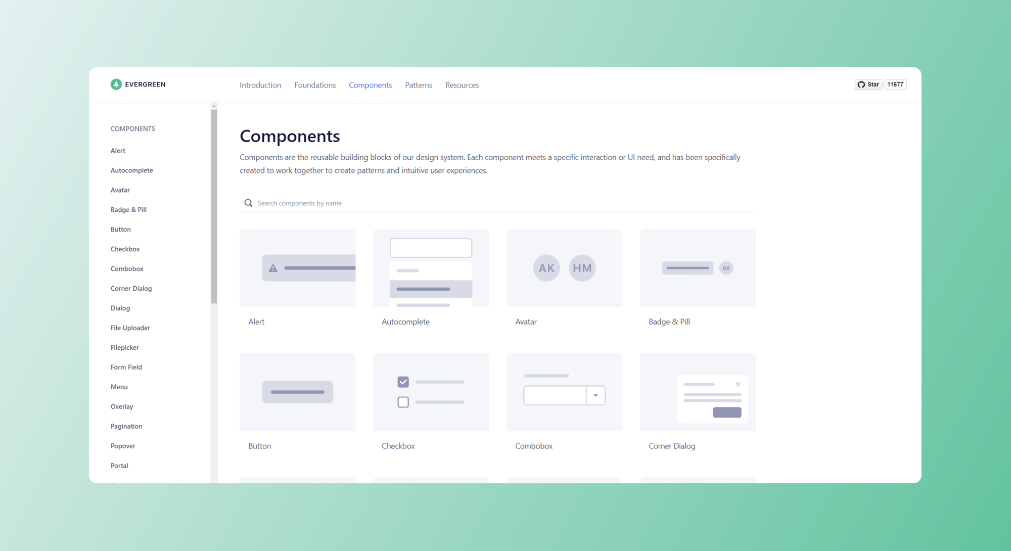
Evergreen is a design system created by the company called Segment. It is a good option for enterprise-grade web apps. It is open source and completely free.
Evergreen offers a rich component library with detailed guidelines on states and complete property lists. You can see how all 30+ components work in your browser from a user perspective and copy the code to your React UI builder.
In addition, all Evergreen components are available on GitHub. Evergreen also comes with a Figma UI kit for designers. You can use it as an asset library and further customize the components whenever your project requires it.
2. Material UI
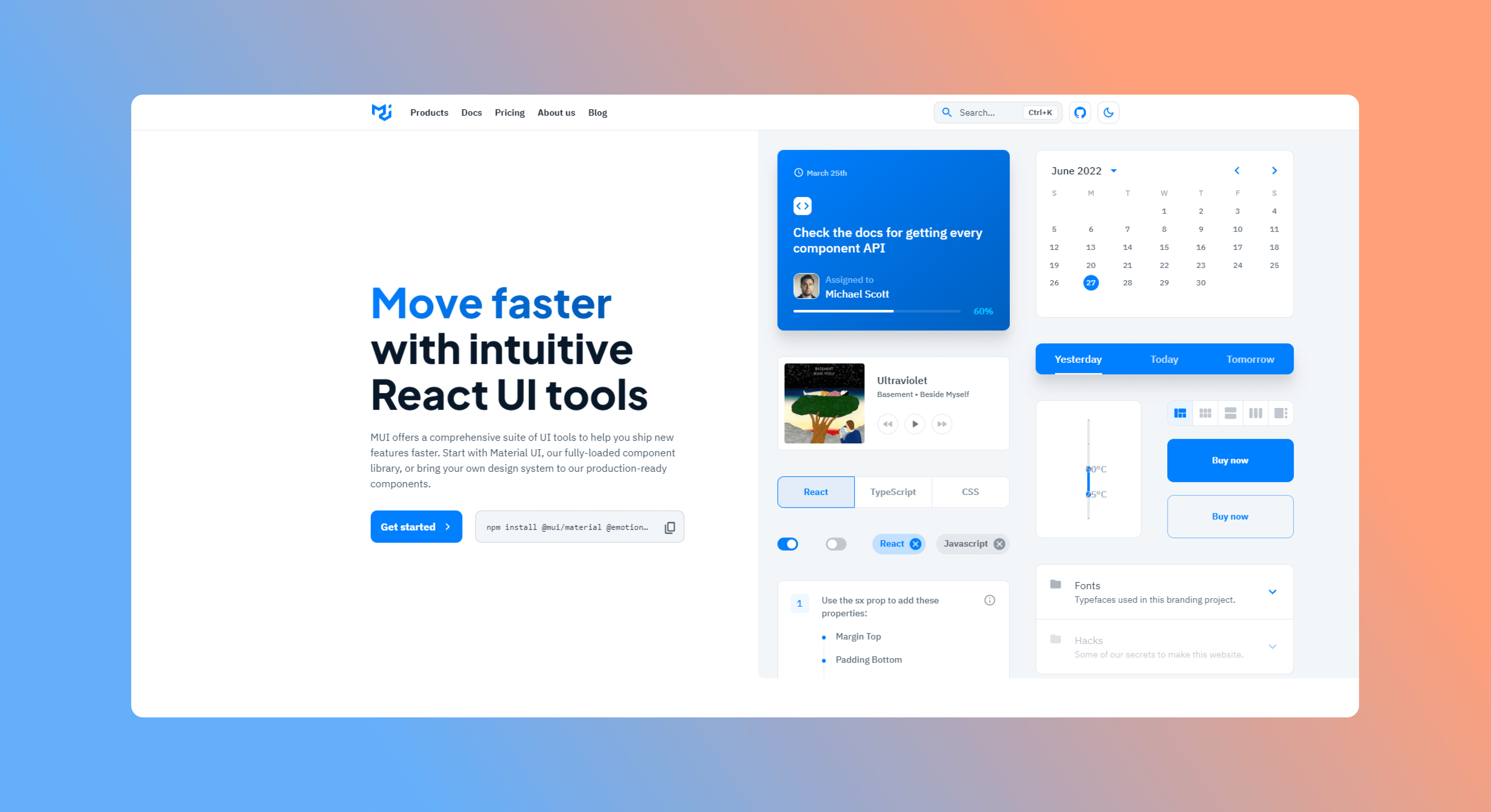
Material UI is a suite of UI resources you can use for the fast development of new features. Its React UI library is a good option for data-rich applications. It contains a ready-to-use component set. The core components are open source and free to use, and you can combine them with your style guide for additional theming. All free resources are available on GitHub.
Material UI offers Pro and Premium subscription plans for $15 and $37 per developer/month, respectively. In addition, Material UI sells advanced design resources, like themed templates and styled UI kits for Figma, Adobe XD and Sketch.
3. Chakra UI
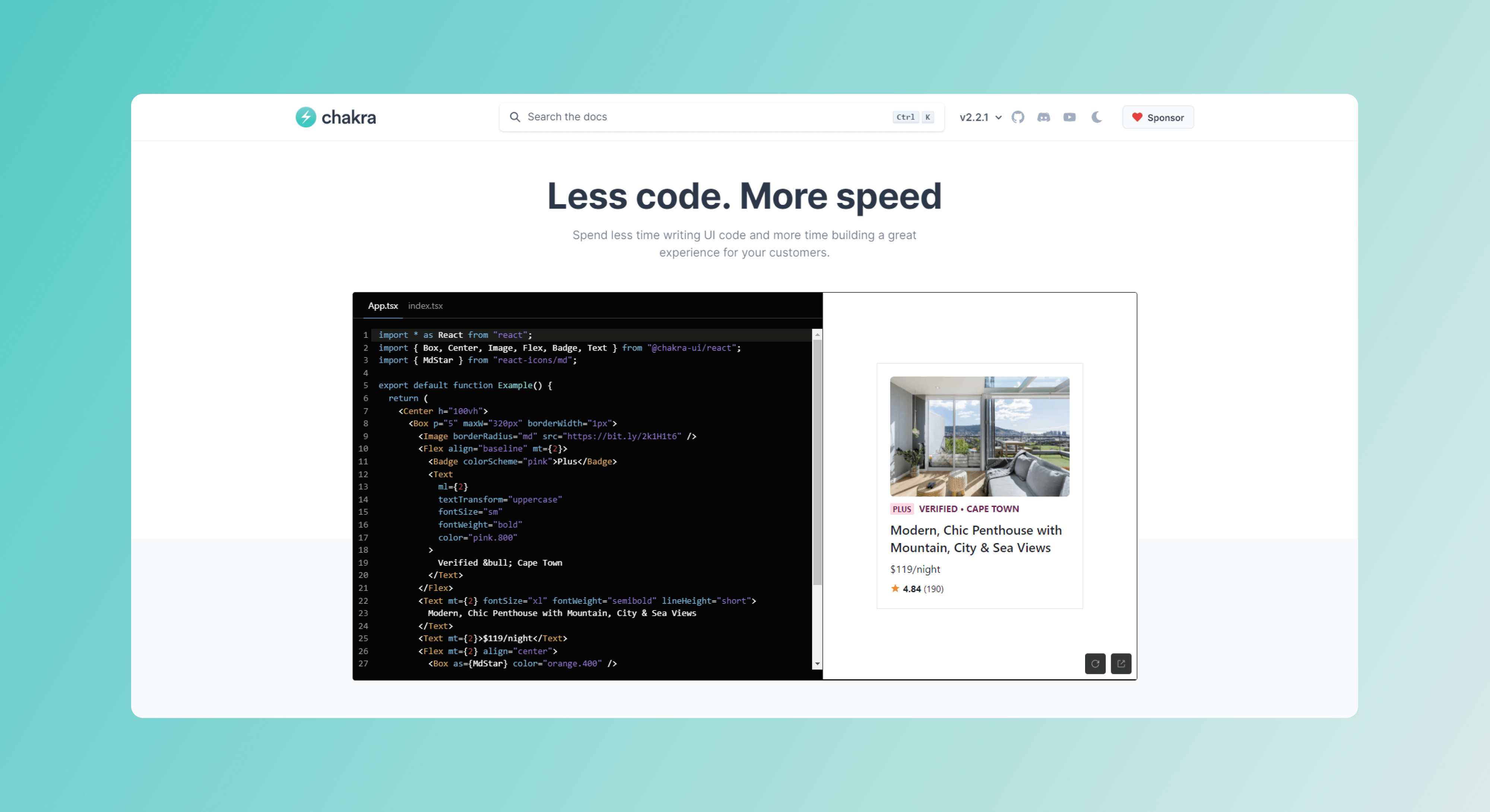
Chakra UI is a free-to-use modular component library. It offers the building blocks necessary for your React app development. Chakra UI is primarily a developer component library and doesn't have a design system attached. It provides detailed documentation for all the components, properties, and states, with live demos and editable code examples directly in your browser. You can find Chakra UI on GitHub.
4. Grommet
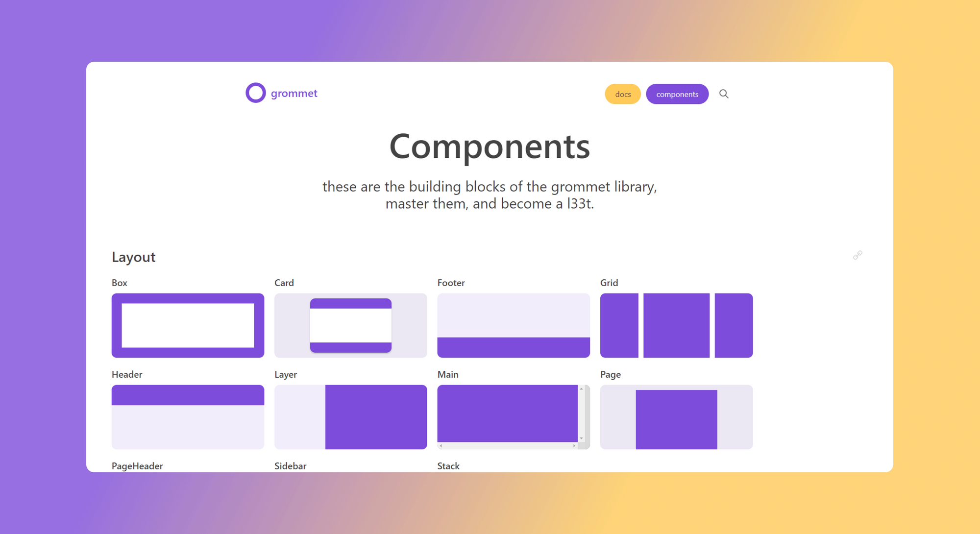
Grommet is a React framework for responsive web development. It offers a neat combination of modularity, accessibility, and themes. The React component library offers examples, live code editing capability directly in the browser, and documentation.
Grommet offers design resources like icon sets and theme kits for Sketch and Adobe XD. It has a basic design system with light and dark-themed components. All Grommet development resources are available on GitHub.
5. Storybook
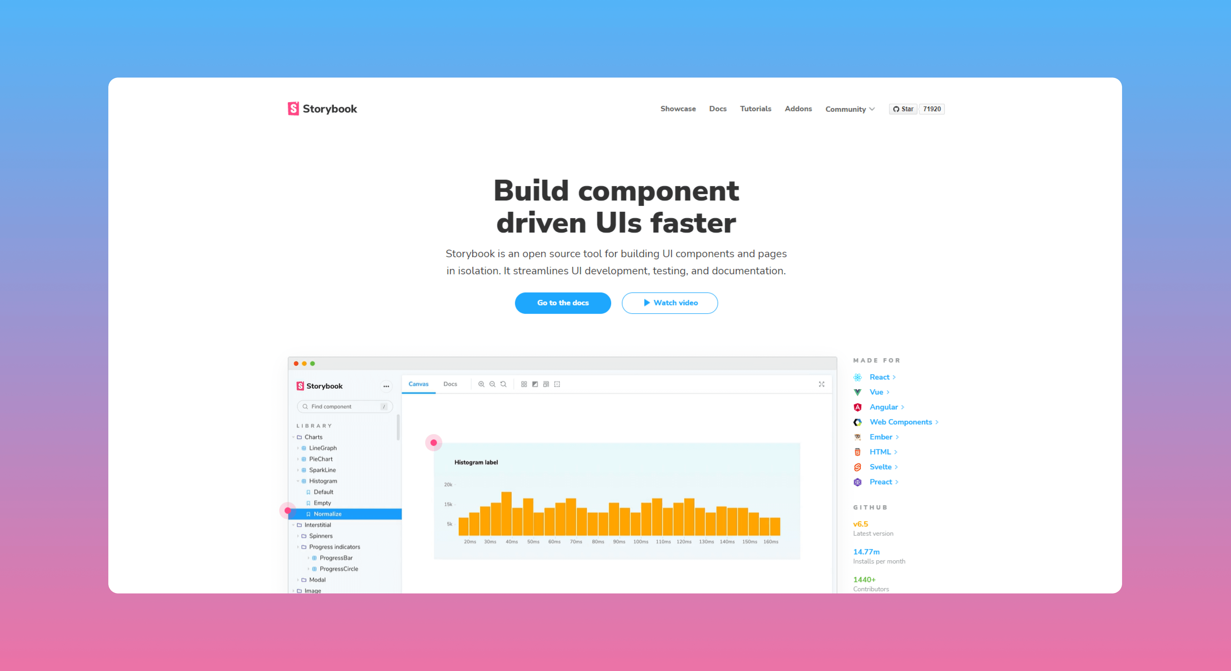
Storybook is a component builder made for focused work on components only. With Storybook, React developers can create, customize and document components without distractions. You can create the building blocks of your UI without running an entire dev stack.
Storybook is an open-source tool available on GitHub that helps you build components and document their use cases. It helps create more comprehensive component libraries. It supports React, Vue, and Angular.
6. KendoReact
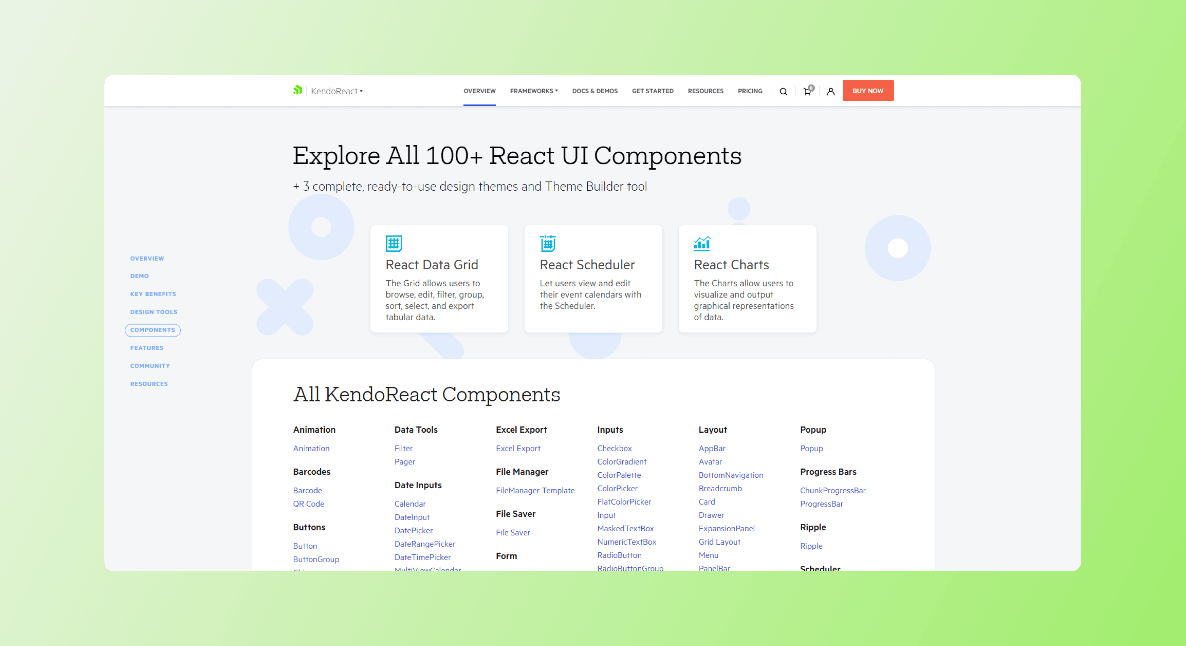
KendoReact is a commercial component library by Telerik, part of the Kendo UI bundle. It offers modern, themed, customizable and accessible components for fast React app building.
Apart from the React component library, Kendo also provides UI components for Vue, Angular, and JQuery.
Kendo is suitable for complex projects that require rich data visualizations. We recommend it only for building enterprise-grade commercial apps, as it comes with a price tag of $999.
7. Ant Design
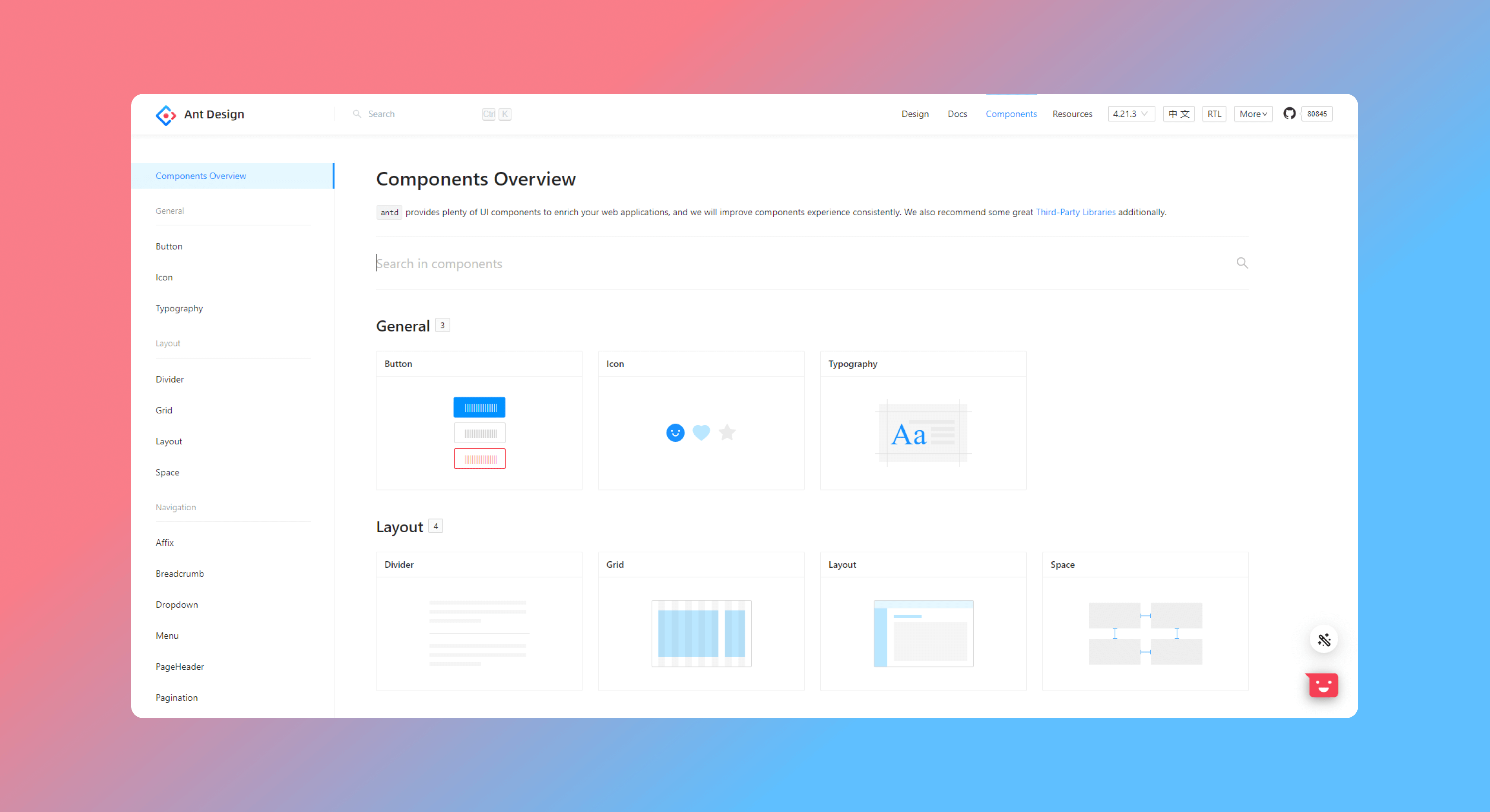
Ant Design is a design system and component library for React UI developers. It is suitable for large-scale design and development projects based on the React UI framework. A typical use case is the development of enterprise-grade web applications.
Ant Design offers customizable components and general guidelines about the design principles for a unified design language. It serves developers and designers equally well. The Ant Design assets library includes components variants and states, icon sets, and type scale guidelines. You can find basic UI building blocks like buttons and input fields and more complex components like navigation drawers and modal messages.
8. Onsen UI
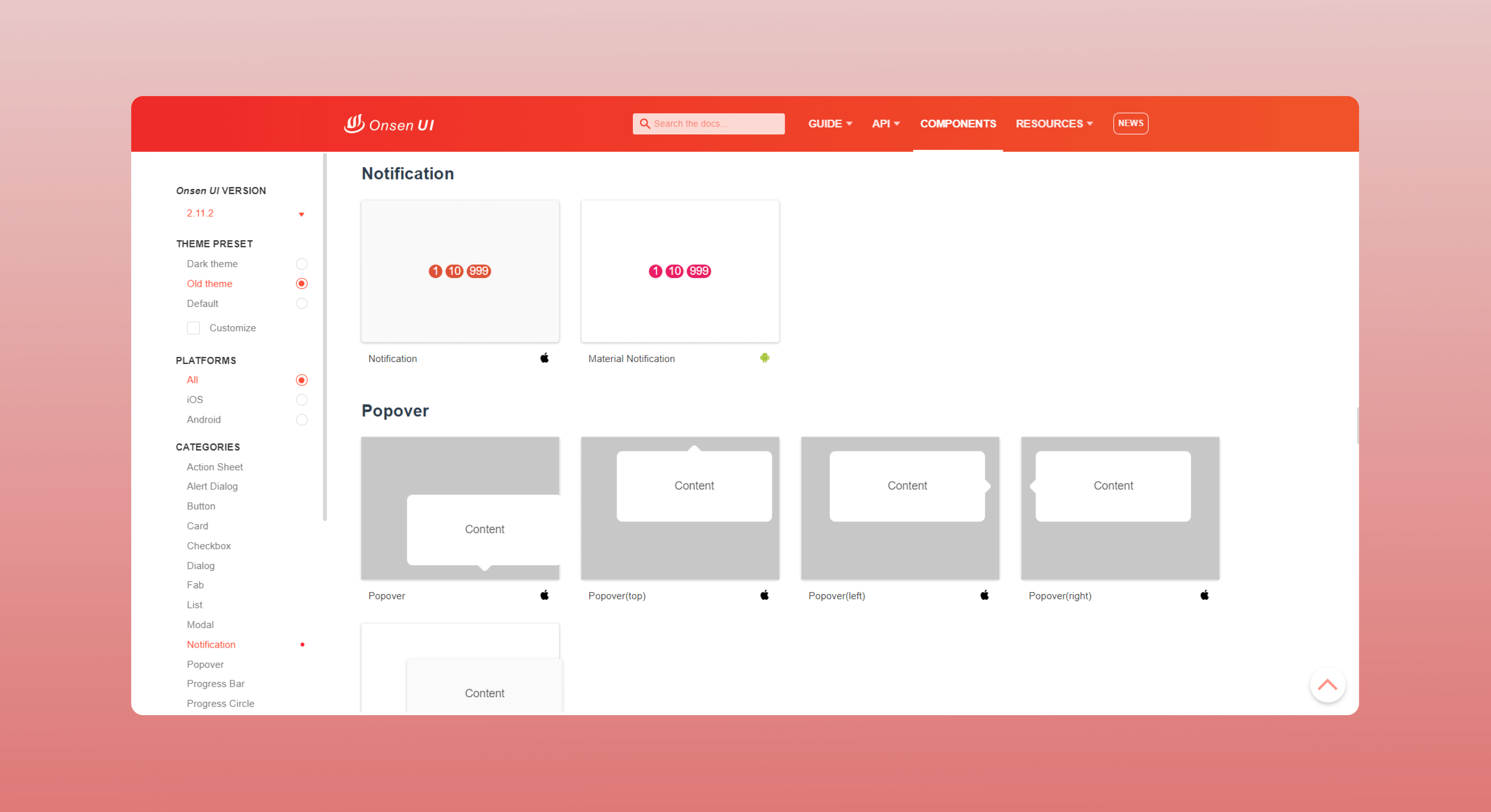
Onsen UI is a resource base for mobile app developers. It offers mobile-optimized component libraries for JS UI framework users, including React developers. Onsen UI provides a web-based theme roller where you can bulk edit components before downloading the CSS styles or viewing the React documentation. You can preview component styles for iOS and Android.
Since Onsen UI focuses on mobile app development, you don't get responsive components, and the library isn't usable for web development projects.
9. React Suite
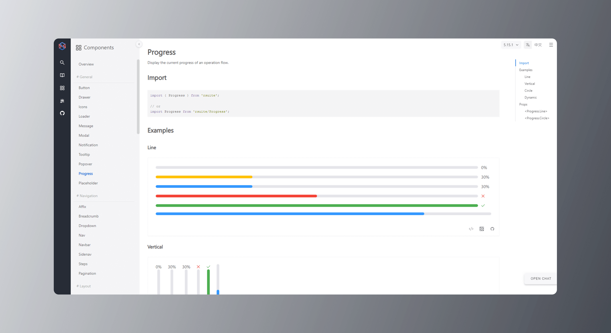
React Suite is a React component library for web apps and back-end products. It provides resources for building enterprise-level web applications. You can find all resources in the React Suite repository on GitHub.
The React Suite component library works like a design system, a component behavior demo, and a source code editor with syntax highlights. You can also use the customizable icon kit and a Figma UI kit for designers.
10. React Bootstrap
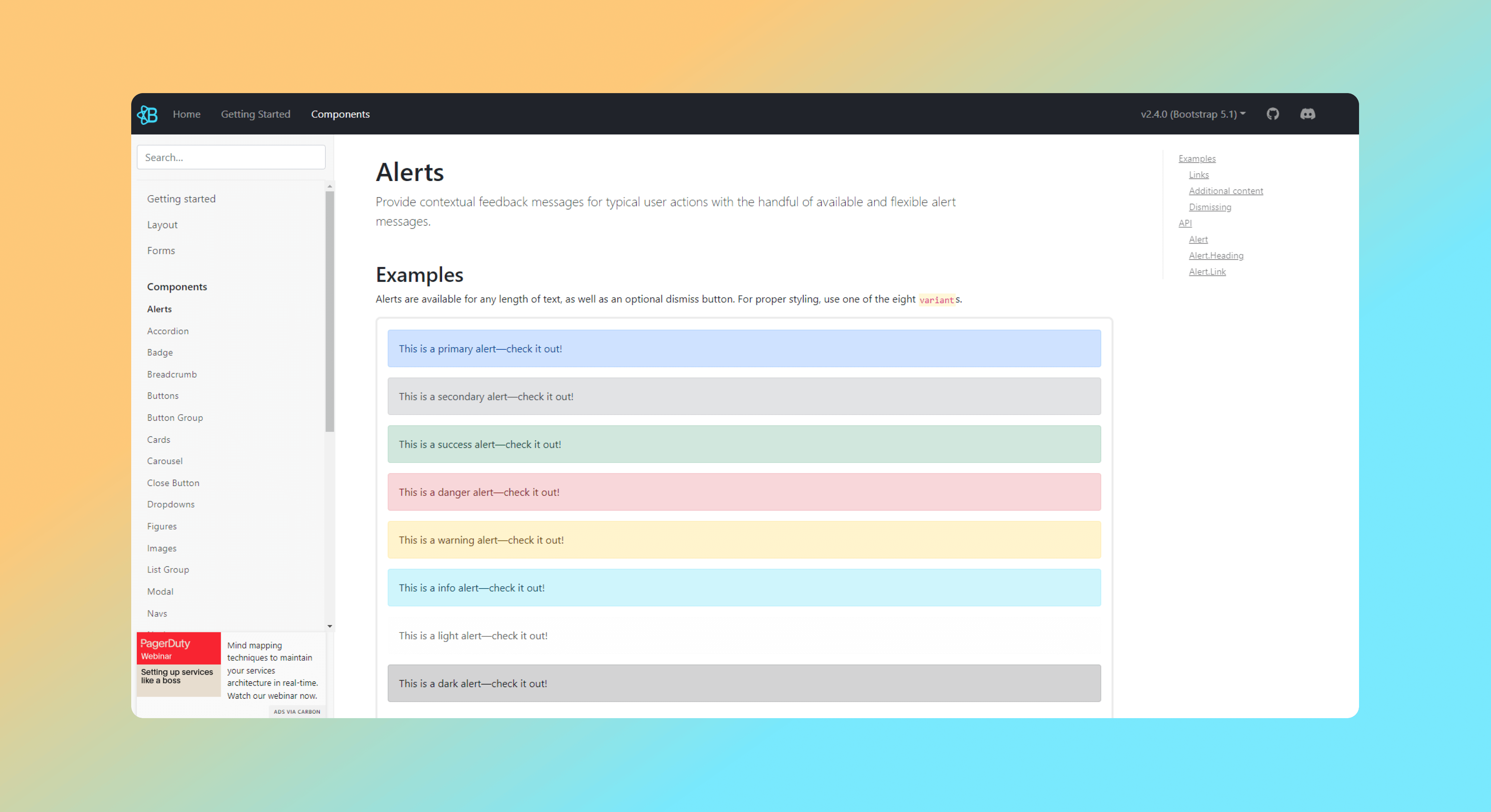
React Bootstrap is an open-source UI library of React components with great flexibility and a wide range of applications. All the components are customizable, and you can edit properties and styles directly in a browser editor to quick-test your adjustments. A good hint when using React Bootstrap is to import separate components and not entire libraries. All React Bootstrap components are available on GitHub.
The popular React UI libraries: A quick recap
To summarize all the essential details about each React UI library, we made a comparison table. Check the details below to match each of the discussed component libraries against the rest on the list.
React JS UI components library: Final words
In this article, we explained why every React developer needs a React component library. We outlined the benefits of using UI component libraries for improved production times and consistency within a user interface. We also listed our top 10 picks to help your search for the best react component library.
A common advantage of all React UI component libraries is they allow the import of ready-to-use components in a React UI builder like TeleportHQ. Tools like TeleportHQ allow low-code visual editing and drag-and-drop building of React user interfaces. Learn more on our website and sign up today to start your next React project.
React UI library: FAQ
React UI component libraries are a hot topic around the web. That's why we found the most common questions people ask online and gave short answers below.
Is React a UI library?
Yes, React is a JS library for building user interfaces. It allows you to develop separate components and combine them in many ways to build complex interfaces without dependencies and design conflicts.
What is a component library?
A component library is a set of standalone components available to developers for direct use or further customization. Component libraries are a valuable resource and an important part of every UI toolkit. They allow fast and easy handling of repetitive work and significantly reduce development and production time.