teleporthq
Piattaforma
Soluzioni
Integrazioni
Risorse

Dai design di Figma ai prototipi responsive

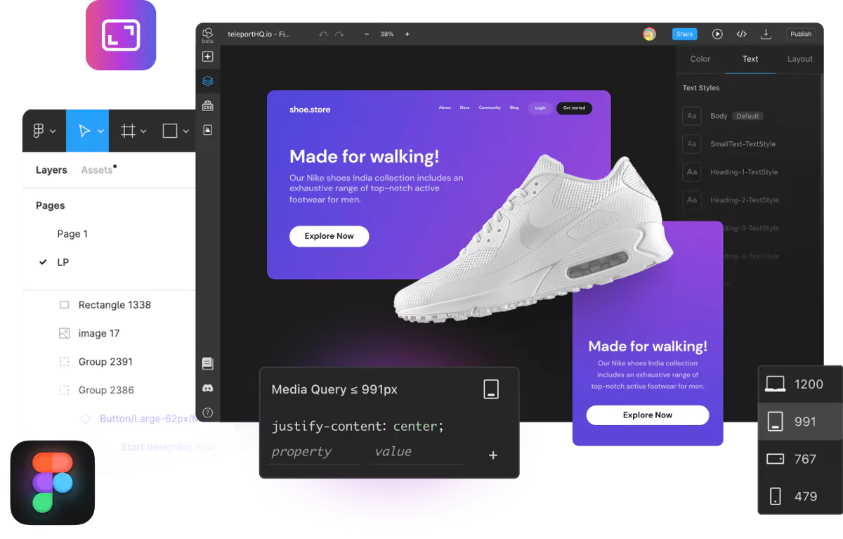
With TeleportHQ, you can turn your Figma designs into responsive prototypes using our straightforward editor without any coding skills.


Discover our platform's responsive UI design tools and see how fast your idea can come to life.
Start building
Figma to responsive prototype header

Design responsive per siti web e app ad alta fedeltà

La nostra piattaforma funziona come uno strumento per creare mockup responsive e ti offre tutta la libertà creativa necessaria per apportare modifiche flessibili e trasformare i tuoi progetti Figma in siti web o app per dispositivi mobili reali e funzionali.
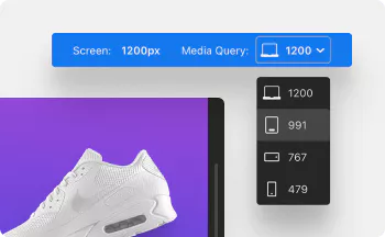
Build responsive prototypes image

Build responsive prototypes

Create your future website or app using all the available responsive prototyping tools.
Validate ideas image

Convalida le idee

Use the preview mode and see if everything will look the way you expected.
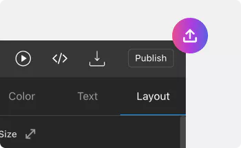
Launch project image

Avvia il tuo progetto

Pubblica il tuo sito web su un dominio di hosting TeleportHQ gratuito oppure usa il tuo.

Tutti gli strumenti di prototipazione adattiva di cui hai bisogno

Progettare per schermi di diverse dimensioni è fondamentale per offrire un’ottima esperienza utente. Con la nostra piattaforma, puoi progettare facilmente un unico layout responsive per tutti i dispositivi.
Github iconDesign in interfacce interattive Export your Figma mockups to TeleportHQ and create responsive prototypes for mobile apps, web app components, or websites.
Sharing iconCrea siti web con il trascinamento Risparmia tempo e budget evitando la fase di programmazione. Crea il tuo sito web o la tua app man mano, sfruttando l’editor intuitivo.
Figma iconBreakpoint personalizzati Create Figma responsive breakpoints, components, texts, and flexbox layouts for responsive behavior across all devices.
Code iconReusable components With our component management system, you can optimize your work by building reusable components which you apply across projects.
Script iconCollaborazione tra team Elimina attriti e colli di bottiglia e invita i tuoi compagni di squadra a collaborare sui prototipi responsive per completare il tuo progetto più rapidamente.
Java editor iconDa Figma a HTML Crea prototipi responsive e trasformali in codice HTML o CSS pulito e riutilizzabile con la nostra piattaforma low-code.

Modelli pronti all'uso

If you choose to export only a few components from Figma, you can pick a template made by our designers and start creating responsive prototypes for your web app components or website.


You can make further edits to your work by adding videos, premium stock photos, and other elements you can find in our library—everything within the intuitive drag and drop editor.
Sfoglia i modelli
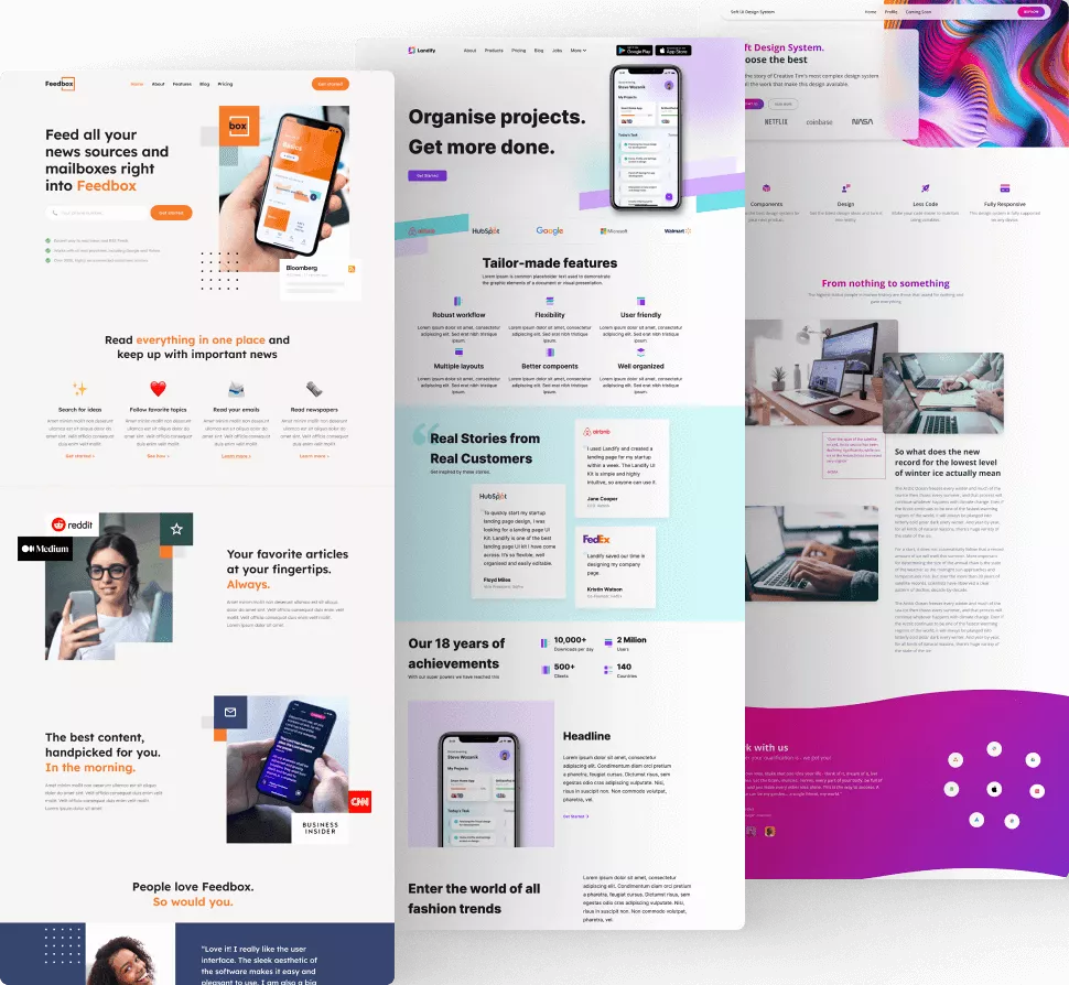
From figma to responsive prototype templates

Come esportare il tuo design di Figma in TeleportHQ

Figma è la soluzione perfetta per tutte le tue esigenze di progettazione e ora puoi trasformare i tuoi progetti in layout responsive esportandoli sulla nostra piattaforma. Ecco quanto è semplice:
1

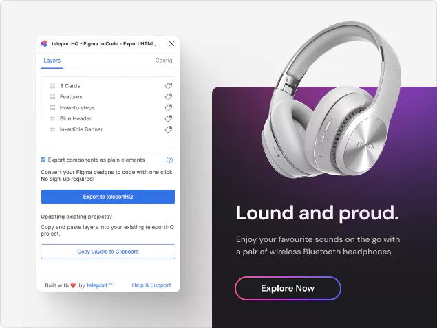
Start the plugin

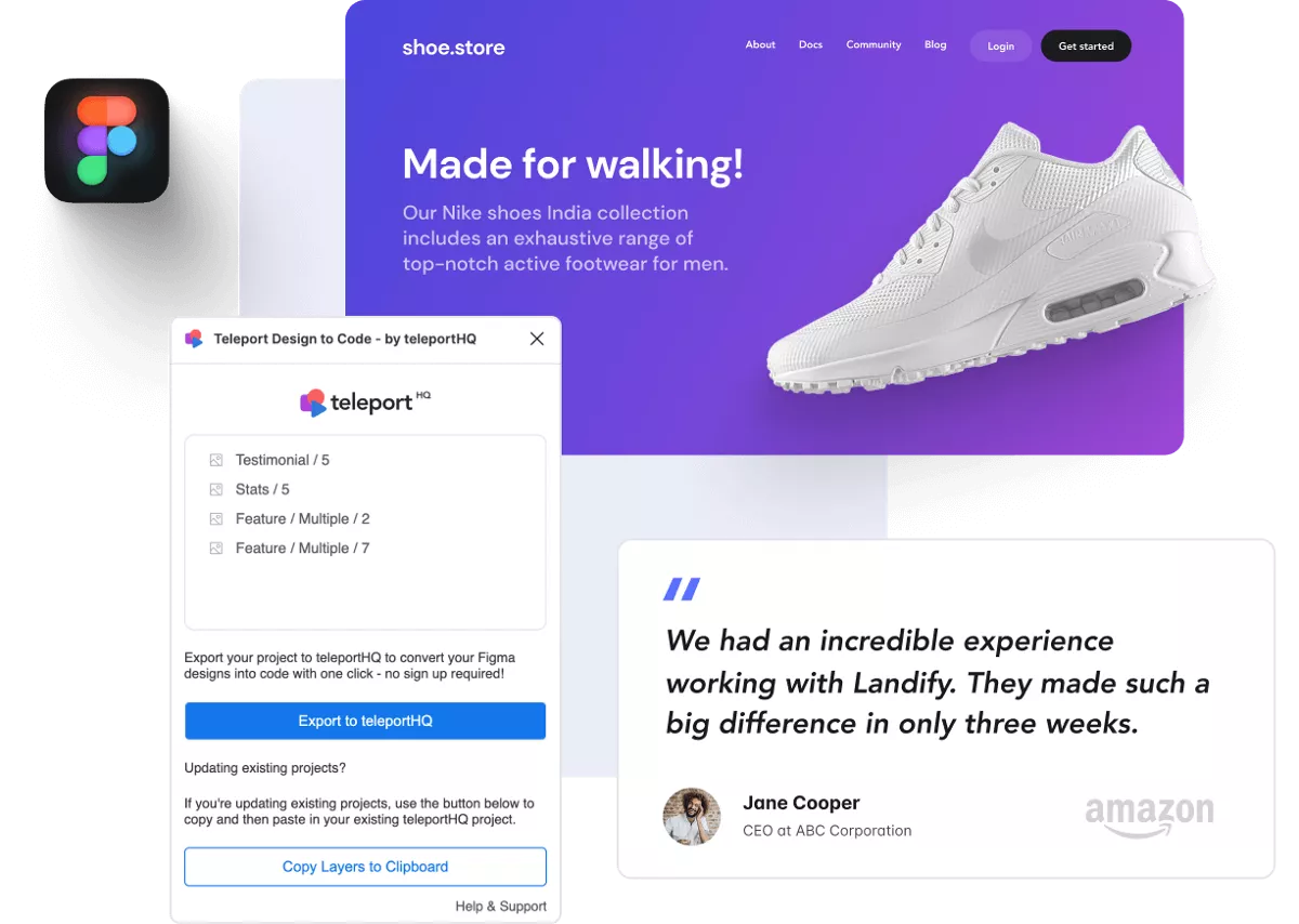
After you finish your design in Figma, launch the export plugin by doing these three simple steps: Right-click 🠆 Plugins 🠆 T TeleportHQ Design to Code
2

Select your frame

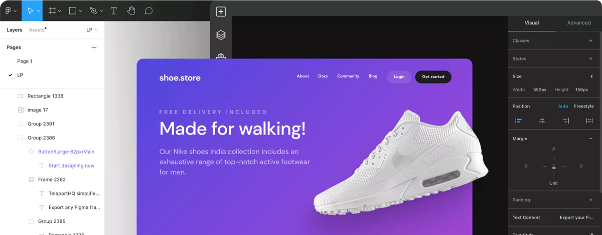
Next, you will choose which components you want to export to our platform.
3

Export your work

In this last step, you’ll export your Figma mockup to our platform, where a project will be automatically created with the output.
How to turn figma to responsive prototype image

Automazione senza sforzo

Save time and budget by skipping the coding part. Easily create your UI design with Figma, then turn it into a responsive prototype with TeleportHQ.


Focus only on the designing part and leave the technical aspect to us. If you're a developer, you can always export your project into a production-ready code and continue working in your environment of choice.
Try the Figma Plugin - It’s Free
From figma to responsive prototype automation

Creative freedom supported by a robust technical foundation

Designing for multiple screen sizes has never been easier. Our platform is here to help you

create responsive prototypes for web app development, mobile apps, or websites that look professional on every device.
Inizia a creare From figma to responsive prototype call to action
made-with-teleportRealizzato con TeleportHQ