User interfaces are the touchpoints that connect businesses and users in the online world. They are the gateway to online products and services. Everything we read, watch, or buy online is accessible via a UI. That's why building user interfaces is an important design task.
In this article, we'll give 15 UI design tips that will help you build better interfaces. We'll also explain how to use TeleportHQ to build an outstanding UI. TeleportHQ is our web-based React UI builder for rapid low code UI development. Stay tuned to learn more, or sign up now to start creating stunning UIs.
Before we list our UI design tips and best practices, let's explain why UI design is critical to your online business.
Why is user-friendly UI design essential for good UX?

Image source: Unsplash
Using a website or app is a cognitive process. Users must put effort into perceiving or completing a task – the higher the effort, the lower the satisfaction from using the product.
User-friendly interface elements reduce the required effort and allow users to complete their tasks faster. Good UI design makes users feel good by facilitating smooth interactions with the interface. User-friendly interfaces eliminate friction points and improve overall user satisfaction.
What makes a good GUI?
Users don't care about the design. They care about their satisfaction when using websites and apps. Their happiness depends on the reason for visiting and the expected results. Therefore good graphical user interfaces are:
- Subtle and focused on frictionless interaction
- Empowering and facilitating task completion
- Aligned with the brand values and appealing to user emotions
User interfaces should guide the users through content and task flows seamlessly. An excellent user interface eliminates unnecessary components and has a strong focus on crucial tasks.
How designing user interface affects your product performance?

Image source: Pexels
Whatever you are offering online, you must attract and retain user attention long enough to create a lasting impression of your product. Well-designed user interfaces ensure that you fully utilize the limited and time-sensitive opportunities to get the user's attention. A good UI helps in the following areas:
- Improves overall SEO performance
- Increases the time spent on site
- Reduces the bounce rate
- Creates a seamless experience
- Reduces user frustration
Now let's see what UI design tips you can follow to create outstanding digital interfaces.
UI development tips and tricks and UI best practices to use in 2022
Most of the best practices in UI design are based on knowledge from other scientific fields, like cognitive psychology and neuroscience. Here we’ll explain how to use human psychology when designing interfaces and share tips to follow in your design work.
1. Conduct user research and know who you’re designing for
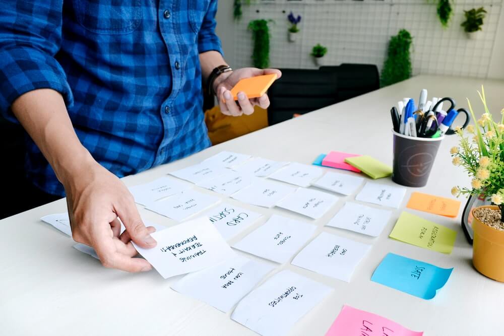
Card sorting is an example of a user research technique in the early stages of design. Image source: Unsplash
All decisions designers make should consider the users, their needs, goals, and the context in which they use a website or app. A common mistake is to design for yourself. What seems logical and accessible to you might confuse your target audience. That's why you must understand your users.
To gain that understanding, you need to conduct user research on nearly every stage of the design process. Data gathered from user research eliminates the guesswork and guides the design process. It provides a mandatory validation for your hypotheses about the user behavior and needs. Research is a great starting point that makes everything easier down the line.
2. Organize and prioritize the information

Image source: Pexels
Every website or app has a hierarchical content structure. All topics fall into logical categories and subcategories. These categories should be familiar and match the user's expectations. A structure that makes sense to the users helps them navigate faster and find important information.
The categories also have different importance to the users. For example, a news app would follow the same logic as a TV broadcast, with the breaking news displayed first and sports news last. Putting important content on top of your content structure is essential when you have limited space, especially on mobile screens.
3. Focus on usability above all else
A usable website accommodates the user's needs in the most common contexts of usage. There are five main criteria to determine if your design has good usability:
- A usable UI helps the user complete relevant tasks and actions and get results.
- It allows fast task completion with a lesser effort from the user.
- It is pleasant to use and is styled appropriately for the given industry.
- It has a smooth learning curve and isn't intimidating for new users.
- It facilitates fast recovery from user errors to avoid frustration and helps users continue using the product.
A good UI will tick all these boxes to contribute to a smoother user experience and reduce the cognitive load.
4. Design for mobile-first
Smartphones are ubiquitous, and nearly 4.7 billion users worldwide have established mobile browsing habits. Mobile page views represent more than half of the global website traffic since Q3 2019. Smartphones have physical constraints, though.
Their screens are small, and the amount of information you can display is limited. That's why designers must build a well-organized content structure with clear priorities. Important content and features should be immediately available. You can pack everything else neatly in underlying layers.
5. Navigation areas should be clear and easy to find
Navigation is critical to usability. It is the means for users to locate content items and features. Navigation goes hand in hand with the content structure and should always reflect the category hierarchy. Otherwise, the user will get confused and frustrated.
Also, the navigation areas should always be visible and prominent both on desktop and mobile. It would help the users to initiate faster transitions from one content to another. When you have a complex content structure on mobile, you can combine primary navigation elements for the important categories and secondary menus for the rest of the items.
6. Ensure high visibility of important elements
Emphasis is the primary weapon against the limited short-term memory of the user. People can remember between five and nine items at a time. Processing information about additional items requires removing older ones from the short-term memory. You can overcome this attentional bottleneck by making essential elements stand out.
Use relative size and color contrast to convey importance. Elements and text with larger sizes and more vibrant colors draw more attention than smaller ones with neutral colors. Regular geometric shapes are perceived better than irregular shapes. Also, any motion, like animated effects or video, draws more attention than static elements.
7. Incorporate highlights and shadows to convey depth and realism
Shadows are used to simulate elevation on a 2D surface. Image source: Material Design
Light and shadows work in the digital world, just like in real life. Every UI has ambient light and a visible (or implied) direct light source. Objects that obstruct light have a shadow. You can use shadows to simulate the elevation of one surface relative to another in a two-dimensional design. That's why highlights and shadows bring a sense of depth and realism to a UI.
A common use of shadows is to mimic the elevation of elements on mouseover and imply readiness for action. Designers often use shadows to show that one surface is above another, e.g., the navigation is above the content.
8. Use white space to establish a visual hierarchy
White space, also known as negative space, is vital for visual separation. Use it to convey which elements belong together and which are different from one another. Proximity implies the elements are related. On the other hand, adding more negative space will make an element stand out and draw more attention. White space is a great tool for directing the eye towards essential elements.
9. Use recognizable icons and symbols
The trash bin is a real-world metaphor commonly used in computers. Image source: Unsplash.
Iconography is one of the most challenging areas in visual design. Icons are tiny and deprived of detail to preserve readability in small sizes. The lack of detail can be confusing as different users see different things. It is challenging with abstract categories that real-world items can't represent.
There are two golden rules for iconography. The first is to use real-world metaphors to represent actions in the digital world. For example, the trash bin symbol always represents an action to discard an item. The second rule is to use text tips to explain the symbol. It helps a lot when the icon is abstract and prone to misunderstanding.
10. Typography should be comfortable to read
Screen readers appreciate the comfort that well-laid legible text provides. Reading requires enough cognitive effort, and there's no need to make it harder. Use stark contrast to avoid accessibility issues – black text on a white background is best.
Create a type scale in advance to ensure headings have enough visual weight. It will make your content easy to scan. Break down large blocks of text into smaller paragraphs to make reading easier. Use fonts with good geometry and balanced letter spacing. Don't use funky fonts for large blocks of text. Finally, save color highlights for links and CTAs.
11. Use dark colors and themes with caution
Dark-themed UI is dangerous territory. Always consider the content and the time of day the users access it. Dark themes work well in gaming and entertainment, for example, because these activities happen in the evening. Also, many developer applications are dark with colored syntax highlights to reduce eye strain and make code reading easier.
For text-heavy user interfaces, it's better to use a light theme. Also, a light theme is better for interfaces requiring a broader color palette, e.g., a dashboard.
12. Keep forms short and simple
Focus is the key here. Keep the number of actions manageable to maintain user focus. The more fields users have to fill at a time, the more likely they are to quit. Stick to the bare essentials and offer fast options, like signing in with Google or a social account to save time.
Break the process into smaller, easy-to-complete steps if you can't skip some actions. In multi-step forms, always indicate the number of steps and which is the current step. Also, label your input fields and provide hints for the user.
13. Make buttons stand out
Buttons are the best way to accommodate important actions. They offer superior features for enhancing the prominence of a CTA. Make sure your buttons are large enough. According to Fitts' law, large click targets are easier to engage.
Also, make sure your CTA is enticing and legible. Use padding to create negative space around the CTA and make it stand out. Finally, choose a background color that has enough contrast with the background.
14. Don’t overcrowd your layout with CTAs
Calls to action (CTAs) are vital to conversion rates. Their success depends on where you put them and how prominent they are. To motivate the user to click on a CTA, you must make it the main focal point. If you place too many CTAs on a web page, you'd have too many elements that compete for the user's attention. It would increase the cognitive load, and the user would feel overwhelmed by too many potential actions.
15. Test your UI design with real people

User testing of high fidelity prototypes helps validate your design. Image source: Unsplash
As mentioned above, user research helps validate your hypotheses about the user's needs. User testing, on the other hand, validates your solutions. It is the only way to determine if your design resolves the specified problem.
Always test your designs with real people before deployment. Use high fidelity prototypes that can be shared online and ask people to complete example tasks. Observe how they interact with the interface. Watch out for friction points, hesitation, and dropouts. Once you have conclusive test results, go back to your design and resolve the identified issues.
How to make UI for website using TeleportHQ React UI builder
Designers need versatile tools to create great user interfaces. Here we give five reasons to use TeleportHQ to design an awesome UI.
TeleportHQ is an online platform for designing, prototyping, and developing static websites. It is an AI-powered front-end development tool for visual coding, real-time code generation, and online collaboration. Here's how you can use TeleportHQ to smash your design challenges.
1. Drag and drop builder with best UI elements
In TeleportHQ, you can design fast by dragging and dropping ready UI elements. Our platform has a library of ready-to-use customizable components that you can style and adjust to your needs. You can create React UI components and entire page layouts in minutes.
2. Ready-to-use templates for professional user interface
TeleportHQ also offers professionally designed page templates you can use to kickstart your website building. The templates are a great starting point when you need a quality layout and don't want to design from scratch. All templates are customizable, and you can adjust the styles as you see fit.
3. Online GUI design tool for creating easy to use user interface
TeleportHQ is a low code platform. It relies on visual coding for building static websites. You can use the graphical user interface to edit components and styles. You can focus on UI design and leave the code part to the AI-wired real-time code generator.
4. Figma integration for importing user interfaces
TeleportHQ offers a plugin for lightning-fast imports of Figma design files. You can use your favorite design tool to create high-fidelity prototypes. When ready, use the plugin to import your design and generate your website code with TeleportHQ.
5. Design export to 11 JavaScript frameworks
TeleportHQ makes the transition from design to code effortless. The platform generates code in real-time. All your designs are ready to export to 11 different JS frameworks for further editing or deployment. These include React, Preact, Gatsby, Vue, Next, Angular, Stencil, plus plain HTML and CSS.
How to design a good UI: Final words
Designing user interfaces requires extensive knowledge and user experience design and user psychology. Following the best practices in the field ensures the top performance of your UIs. When it comes to building a UI, it's best to rely on tools for real-time code generation that will turn your design into deployable code. TeleportHQ is an excellent choice because it allows fast drag and drop UI building and customization with minimum coding. It harnesses the power of AI to generate SEO-friendly code and turns your designs into usable websites.
Sign up with TeleportHQ today to start building fantastic UIs.