One of the first things we all notice about a website is how visually appealing (or not) the design is. And yet — as the developers among us will know — the web design process is about so much more than making the UI look pretty. A well-designed website will offer far more aesthetics. It should grab potential customers' attention, then carefully guide them through your product and company, ultimately leading to a conversion.
To do this, your website needs to be designed in a way that makes every element of your site work towards your defined goal. Color, fonts, layouts, textures, and workflows should work holistically to provide a seamless, enjoyable experience.
How can you achieve these sorts of results for yourself? Follow these 7 website design steps and enjoy a smooth process with outstanding outcomes.
Step 1: Identify your website’s goal
Without a goal, your team will have nothing to work towards. During this first stage, the design and/or marketing team needs to discover the true purpose behind the website design. While the answer may seem obvious on the surface — you need a working website for people to visit — the design process should actually achieve a far deeper goal.
To identify this underlying goal, you need to have a discussion with your design team and stakeholders (be that internal or external) to decide:
- What is the website for? (i.e. inform, sell, entertain)
- What is your target audience?
- What do you wish to accomplish through your website?
- What services do you want to offer?
- Will the website need to convey the brand’s core message, or will it need its own focus?
- Who are your competitors (direct and adjacent)?
- What are your competitors doing — and should this influence your design or provide an antithesis you should work against?
Only when you have the answers can you begin to understand the true purpose of your website.
Having a clearly defined goal will ensure your design process sticks to the right tracks and builds in real value for your customers.
Step 2: Scope definition

Scope creep is one of the most common, and difficult to combat, problems that will come up during the website building process.
It’s almost inevitable that new tasks will pop up during the web development process. Unfortunately, the amount and quality of work will suffer as the development team races to tackle fresh issues.
The same can be said for over-eager clients who insist on expanding the project during the process of building a website. You may start off simply building an e-commerce website, but as the project progresses the client realizes they could also include social aspects, and messaging, oh and what if we integrated with this platform, and maybe add a sharing function…
This is something nearly every development team has had to deal with — and it can derail the project. As more and more ideas get added to the product backlog, the amount of hours worked goes up, the project goes over budget, and the product release ends up delayed.
Avoiding scope creep requires careful planning in the early website design stages — accounting for every task and potential ideas that could improve the product. Brainstorming sessions can help identify everything the website will need, allowing for lengthy discussions that uncover new ideas that would otherwise come up late in the development process.
Using something like a Gantt chart to visualize the project timeline can also be useful when it comes to avoiding scope creep. It allows everyone to clearly see how far along the project is, which tasks have been completed, which tasks are still to do, and if the project is running on time and on budget.
Step 3: Prototype
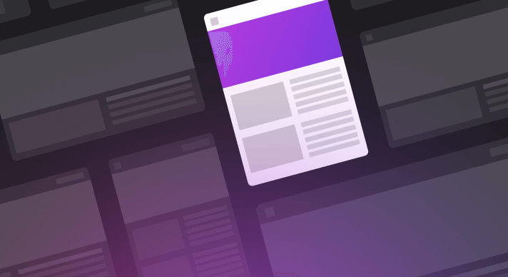
Now it’s time to get hands-on with the development process. To get started, you need to create a simple prototype that defines page hierarchy and basic page flow. This is referred to as the sitemap.
The sitemap will form the foundation of your website. It gives your development and design teams a clear idea of how the site should work while helping them to understand the links between each web page and the content it offers.
Essentially, the sitemap is a blueprint. You can build a house without a blueprint, for example, but it probably won’t work very well.
See also: How TeleportHQ uses natural language to build low-fidelity designs
Once your sitemap is complete, it’s time to look at aesthetics. Search for some design inspiration and use it to create a wireframe mockup of your site. This basic model will allow your team and other relevant parties to test the website flow and functionality to identify any issues early.
Not got time for rounds or wireframing? TeleportHQ hooks you up with a library of web design templates, allowing for fast and simple web building with a drag-and-drop editor. See it in action for yourself.
Step 4: Content
While the sitemap helps to form your website’s foundation, content acts as the building blocks that make the final product hold up. You could have the smoothest page flow, zero bugs, and a winning aesthetic, but none of that matters if your content is lacking substance.
Content serves two key purposes:
Engagement and action
The aesthetics of your website will grab someone’s attention, but it’s down to the content to keep their focus. It’s important to consider how that content is presented, as well as the content itself.
Long, dull, lifeless, overcomplicated, and/or waffle-y sentences will make your reader switch off faster than you switched off while reading this very sentence! You need to offer short, snappy, useful messages. This allows you to grab your reader's engagement and, crucially, keep it.
For pages that require a large amount of content, such as this blog post, “chunking” your content can help make it feel light and engaging. Break large pieces of text into manageable paragraphs, including visual elements that support your content.
You could even break it down into separate pages — like you would expect from a book. This is a quick and easy way of increasing page views, which can really help if your website relies on advertising to create a revenue stream.
SEO
Search engines can’t read the aesthetic or layout of your website. Traditional, text-based search engines read the content on your page to identify what the page is for and how relevant it is to the search parameters.
This means you should be tailoring your content to how search engines view your content, as well as your target audience. This is what we talk about when we talk about search engine optimization (SEO).
SEO knowledge is crucial to creating a successful website. You need to get your keywords and keyphrases right to help search engines put your site into the hands of your target audience. You can use tools such as Google Keyword Planner, Google Trends, and Screaming Frog’s SEO Spider to identify the keywords and phrases real people are using to find the content you will be offering.
Think of SEO as a marketing tool that is baked into your website.
While you may think about adding a list of keywords on the page to trick the system, that won’t work. Search engines are looking for keywords in the H1 tag, meta description, and main content. They also look for well-written, informative prose, rather than just keywords.
It’s down to your content creation experts to give you content that contains all the keywords and keyphrases you need for great SEO, without becoming disjointed.
Step 5: Visuals
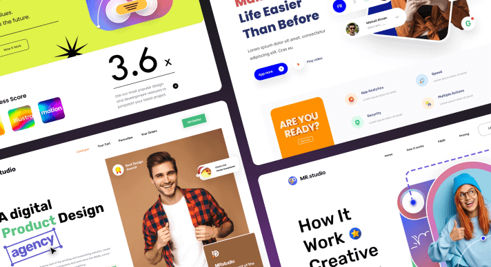
It’s finally time to create the look and feel of your website!
A 2015 survey revealed what most of us already figured: buyers prefer visual and interactive formats rather than long-form text. And while 2015 was quite a long time ago now, chances are consumers’ attention spans have only gotten shorter since then.
So while you may have incredible content ready to launch, you still have to design the aesthetics in a way that draws people to it.
Images are a given when it comes to e-commerce, as you need to show the customer exactly what the product is before they buy it. However, the benefits of visual elements may not be as obvious for other kinds of websites.
Including images can help break up a long piece of text to make it more digestible for the reader. More importantly, they can enhance your message and convey key points without the need for lengthy explanations.
Getting your visual aspects right can make or break a website, both figuratively and literally. Including professionally-shot photographs or high-resolution graphics can dramatically increase your website’s load time. Considering that a person’s average attention span is around 8 seconds, you need to make sure your site loads quickly.
If your website takes too long to load, the customer will lose interest before they even get to see your CTA.
There are a number of tools you can use to optimize your images and decrease load times. Free websites such as Optimizilla can quickly and easily optimize your images, while professional design software, such as Adobe Photoshop, offer built-in optimization during the exporting process.
Step 6: Testing
By this stage of web design, we should be looking at an almost fully functional website. Ideally, you will have done some early testing with your wireframe prototype, but this is the stage in the website building process where everyone can roll their sleeves up and get stuck in.
Each page should be tested to ensure that it loads correctly and each link should be checked to make sure it takes the user to the correct place. This extensive testing stage can unearth small mistakes that could detract big time from the user experience.
This would also be a great time to look over your meta titles and descriptions to make sure your SEO is the best it can be. Even something as insignificant as the order of the words in your meta title can affect the SEO performance.
Putting your website under such extreme scrutiny is a tiring and laborious process, but it can mean the difference between a sale and a customer walking away.
Step 7: Launch

Okay, we have the content, we have the visuals, we’ve tested everything. It’s time to launch!
While this may seem like a time to celebrate and wash your hands of the project, your work isn’t quite done. It’s unlikely that your website launch will go perfectly on the first attempt. Really unlikely, in fact.
Web design is a fluid process, taking time, effort, and constant optimization. It can be a never-ending search for the perfect balance between form and function. Yes, you need to make everything look fantastic, but you also need to make sure your website works as expected.
Even the best developers understand that tweaks will be required well beyond the launch stage.
Post-launch, you and your team will be looking at ways to improve and refine your website. Now that actual users are involved, you can gather real insights into how customers interact with the design. These insights can guide your post-launch strategy and be used to help build future products.
Is there an easier way?
If just reading this seven-step guide has left you feeling drained of all enthusiasm and desperate for a smart shortcut. You’re in luck! With TeleportHQ, you can create amazing websites with ease as our platform automatically writes and deploys code on your behalf. You can even launch your website straight to a custom or free TeleportHQ domain, without getting any other third parties involved.
TeleportHQ’s easy-to-use platform features drag-and-drop elements to quickly build and adjust your website. You can start from scratch, or use one of our professionally designed templates to get you up and running even faster.
Built-in SEO features like Gzip, minification, and CDN make it simple to create high-performing websites to help your website get noticed by the right people. Meanwhile, your images will load faster than lightning thanks to TeleportHQ’s intelligent image management system (it automatically compresses and converts any image into a format that best suits the browser).
Once you’ve built your site, you can export your code in a range of formats including React, Angular, Vue, Next, Nuxt, and good old HTML. Figma users can copy element layers from Figma to TeleportHQ and even convert their projects into HTML with our free Figma plugin.
All of this means you can simply focus on what truly matters, whether it’s to educate, entertain or sell your products. Get started today and your first 3 projects are on us!


