
After months of iterations and feedback from our users, we’re incredibly excited to launch our latest platform version!
This new version comes with considerable improvements, including a brand new collaboration engine which enables teams to build user interfaces with unprecedented efficiency. Moreover, it provides a significant step towards building fully-fledged front-end applications.
In this blog post, we’ll briefly describe some of the features we’ve added and highlight others on our roadmap.
New real-time collaboration engine
The new engine enables collaboration sessions between dozens of users. It also enables our engineering team to ship new features faster than ever before!
Behind this engine, there’s a year of under-the-hood work. Instead of simply updating the existing engine, we decided to go all-in and rewrite the entire platform. It was a strategic decision which prioritized investing in long-term gain.
We’ll cover this decision, the challenges, and the implications more in-depth in a separate blog post.
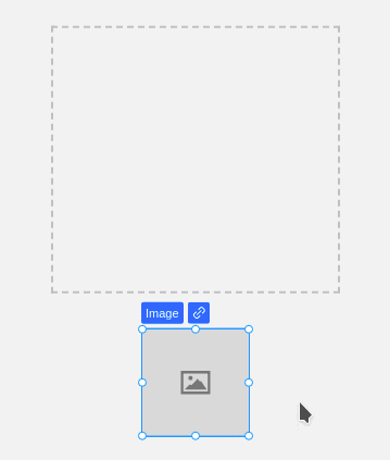
Drag and drop functionality powers up!
Drop items where you want, update their position, automatically group multiple items, or place them freely. The platform’s drag and drop functionality is so much more powerful, straightforward, and easy to use.
Are you a designer trying to place items in the right spot? We’ve got you covered!
Are you a developer who wants to move quickly without having to think about which flex property you should set? Is it justify-content or align-items? Just place the items where you want them. We’ll do the updates for you.
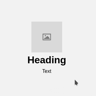
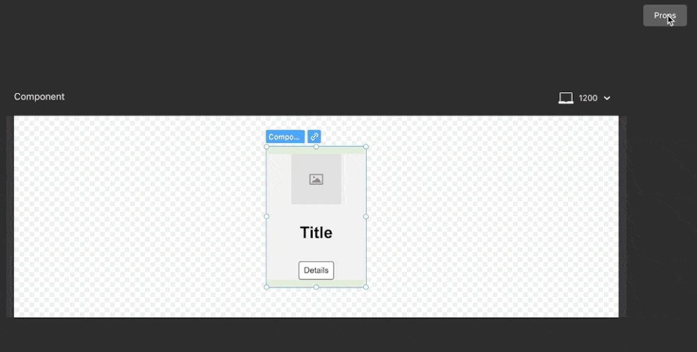
Improved components properties support
Working with components and component properties becomes more straightforward. From now on, properties are automatically detected and created for texts, links, and images.
In the next release, we’ll bring style overrides and variants for your components.
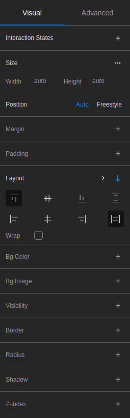
A much friendlier visual inspector
The Visual Inspector is now more than just CSS properties put in a GUI: it is human-friendly.
In the initial version, the user needed to know what display flex, block, inline, or none should do with all the implications. You needed a solid technical understanding of CSS to how it works.
The new version creates a more intuitive experience for designers and non-technical users while still allowing developers to work directly with CSS properties.
These improvements are part of our ongoing research to bring a customized and friendly building experience to each team member, regardless of technical experience.
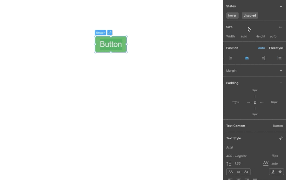
UI States
This new version allows you to easily set hover, active, disabled, or other states from the inspector panel.
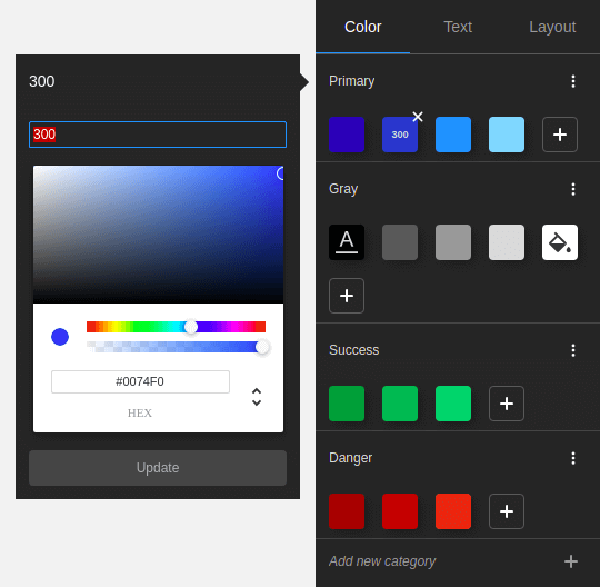
Design tokens
We also added design tokens. A design token can be a color, font style, or dimension property. For each project, you can define custom sets of tokens.
Once you create a token, it becomes available as a variable throughout the project. Instead of repeatedly and manually setting properties of similar elements, you can use one of your existing tokens. If you change the token’s value, we’ll automatically update all the dependent elements.
Besides the evident benefits of speeding up your work and having a centralized view of your atomic styles, the code is also optimized in the background. For each design token you create and use, the code generators will output a reusable global CSS style, leading to a lighter code bundle.
What’s next?
For more information about our plans moving forward, future releases, and feature requests, you can check our Public Roadmap available on Trello.
Highlighted items include:
- Anonymous Session
- Build user interfaces without having to create an account. Share a project with a user who does not have an account.
- Figma plugin
- Import Figma designs directly into the platform
- CSS classes
- A long-awaited feature. Share styles across elements without creating components or manually copying and pasting styles from one item to another. This is the foundation for external stylesheet support like Tailwind CSS, Bootstrap, Chakra UI, Material UI, and other libraries.
- Interactivity, event handling, and conditional rendering
- Add event handlers for click actions, trigger element visibility based on conditions or user actions, and more.
- Data fetching and data mapping
- JAMstack, here we come! Integrate your preferred headless CMS and connect the data to your UI, and you’re good to go.
- Repeatable elements
- Use tables, lists, or other iterable elements.
- Workflow integration for developers
- Integrate your project with GitHub or CodeSandbox. We’ll add a CLI to integrate your design with an existing codebase.
We would like to thank all our users for their precious feedback and the time they have spent with us during user interviews. This release could not have been possible without their valuable contribution.