Developer experience (DX) and user experience (UX) don’t always complement each other. More often than not, a tool that offers a good DX can create a bad UX for the end user and vice-versa.
A recent study showed that, on average, React based websites perform worse than jQuery based server rendered ones. Does that mean that React is a bad tool? Not at all. But frameworks come with a cost that ends up being paid by the end user.
The user doesn’t care about JSX, Web Components, CSS-in-JS and other nonsensical debates in the dev community. But they care indirectly about semantic HTML if they rely on a screen reader. And they care about the total page size in 2G/low 3G connectivity or when they don’t have an affordable data plan.
In software, a good abstraction solves problems effectively while hiding the underlying details. When we use a tool to solve a complex problem, we assume it works as a good abstraction. Hence, tools and frameworks should be the safety net that handles common problems like performance and accessibility. But a lot of these tools handle only our selfish needs (the DX) and largely ignore user needs (the UX).
So today developers need to be proficient in: web performance, image optimization, accessibility and security, if they want to build a decent experience for their users. That comes on top of an already growing list of skills they need to grasp before even shipping their first “real project”. They end up fighting the frameworks that should be there to serve them.
Luckily, some framework authors are already taking steps in this direction. They look for ways to support code splitting out of the box. They integrate linters for sensitive things like accessibility and security and so on. But there’s a long road ahead and this needs to become an industry direction.
So we asked ourselves:
- Who are our users?
- Are they the developers, designers and content creators that are using the tool daily?
- Or are they the consumers of the content that the platform generates?
We ended up understanding that we offer a direct experience for our customers and an indirect experience for their users, the consumers. We strongly believe that taking steps to improve the experience of the consumers is a way to better serve our customers. We will not pass the entire responsibility of building accessible, secure and fast web applications to them.
Here are a few actions towards building that safety net into our product:
- Bake in the best practices
- Prevent harmful actions
- Raise awareness and educate
Bake in the best practices
There are situations when opinionated choices make sense from the UX perspective. In time, the community came up with these best practices for building web applications. We should not have to worry about them for each new project.
Take image optimization for example. Images represent 75% of the weight of web pages
according to httparchive.org. But not everyone has the skills nor the tools to create the most optimized images for their users. Image optimization can get complex very fast, with different formats, pixel densities and responsive sizes.
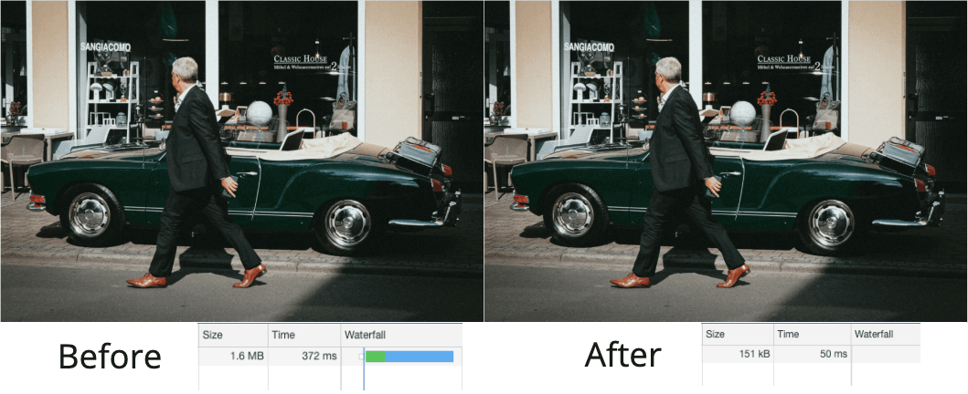
We recently added a service that resizes the images you upload according to the containers in which they are used. This is hidden for you, as we just assume you want the most optimized version of that image for the finished product. In the coming months, we will work on a solution to generate responsive images and on shipping webp formats for browsers that support it.

The image is resized according to the container in which it is used
At this level, the platform works on your behalf and does the “magic” behind the scenes, without needing your input.
Prevent harmful actions
You shouldn’t have to run production audits to find out that your image does not have an alt text or that you accidentally nested some anchor tags. These are all things that can be signaled at “build time”.
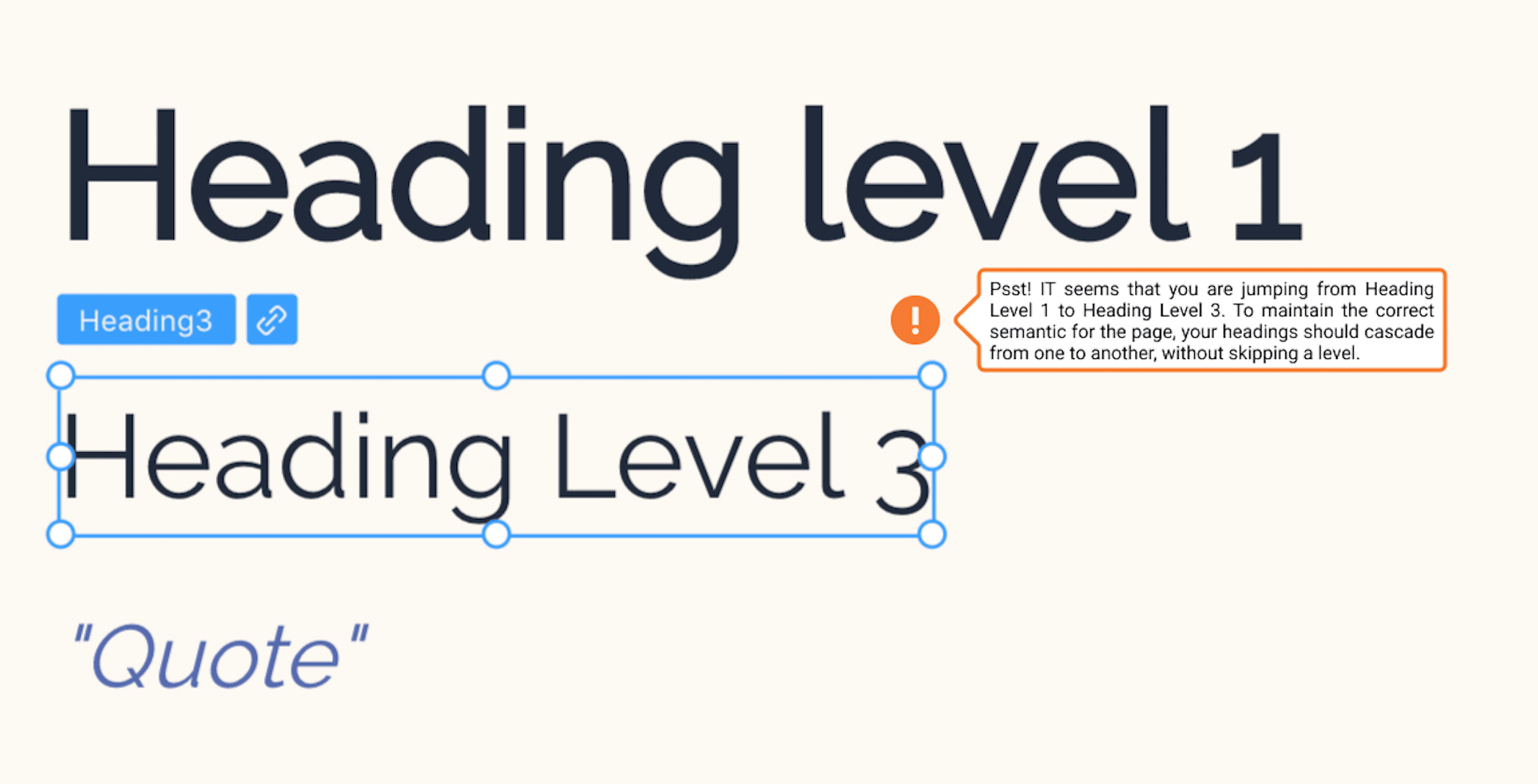
We can ensure that invalid/incorrect states are not possible because we have all the information about semantics in real time. For example, we can prevent the nesting of anchor tags or the incorrect hierarchy of headings as you are designing your page.

Disclaimer: This feature is not yet implemented, it is in the design proposal phase
In this scenario, the knowledge in the platform blocks actions that can harm the user experience.
Raise awareness and educate
Finally, there are usability recommendations that you may need to be made aware of. Acting on them is your decision, but it needs to be an informed one.
Color contrast is a great example. You should decide if contrasts respect the AA or the AAA recommendations from WCAG, based on your target audience. We can highlight the problematic areas, give insights and point you towards educational materials on the topic.
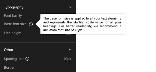
Font size is another example. The minimum recommendation of 16px can be respected or not, based on the purpose of the application that you are building. But the platform will highlight the implications of your actions, so you can make that informed decision.

The tool displaying an informative message about the standard font size.
We’re still making our first steps towards this, but we’re confident it’s the right direction for our product. We believe the Playground should be a servant development tool, which has direct implications for you, as a customer, and indirect benefits for your users. Because at the end of the day, your users are our users as well.


